
Hallways are funny spaces. We walk through them every single day, yet they’re usually the last place we decorate.
A hallway gallery wall changes that instantly. It turns a pass-through into a place that feels personal, layered, and lived-in.
Hallway Gallery Wall Ideas aren’t about perfection or matching frames. They’re about telling a story as you walk by.
Family photos, art you love, little moments you don’t want to forget. When it’s done right, a gallery wall makes the hallway feel like it belongs to the rest of the home instead of being an afterthought.
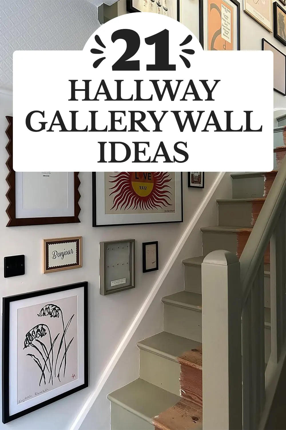
Below are hallway gallery wall ideas that feel stylish but still relaxed. Nothing too stiff. Nothing too precious. Just ideas that make you slow down for a second as you pass by.
Colorful Frames Along the Stair Turn
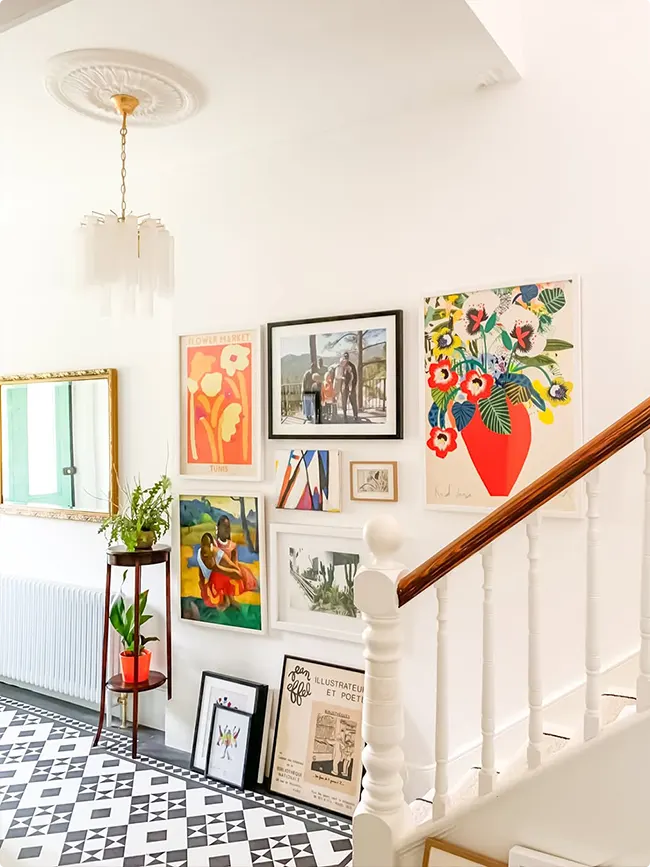
This gallery wall uses the stair landing so well. Bright art, mixed sizes, and a few leaned frames keep it relaxed.
I like how nothing feels too matched. The white walls and railing calm everything down, so the colors can have their moment without feeling loud.
Collected Art With Old-Soul Energy
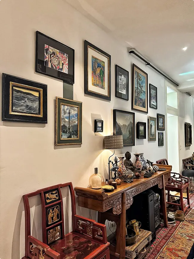
This hallway leans into a layered, collected look. Dark frames, classic art, and a long console make it feel like a quiet gallery you’d wander through slowly.
What makes it work is the rhythm. Even with different frame sizes, the spacing feels steady, so your eye keeps moving without getting tired.
Soft Pink Wall With a Quiet Gallery Moment
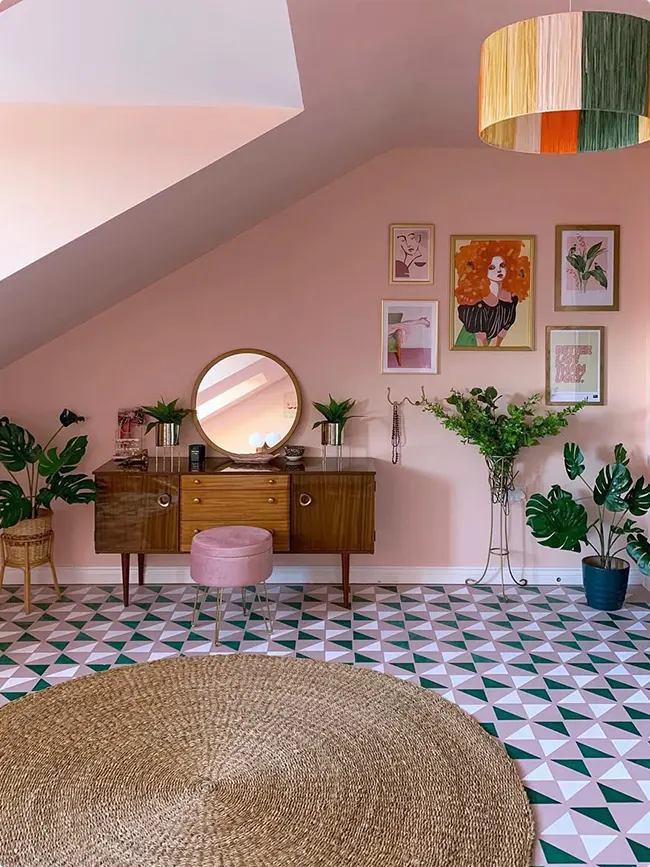
This hallway feels gentle and personal. The blush walls soften the framed art, and the spacing gives everything room to breathe.
I love how the gallery doesn’t try to steal the show. It sits comfortably above the console, letting the mirror, plants, and floor pattern all share the spotlight.
Coastal Colors With Mixed Frame Sizes
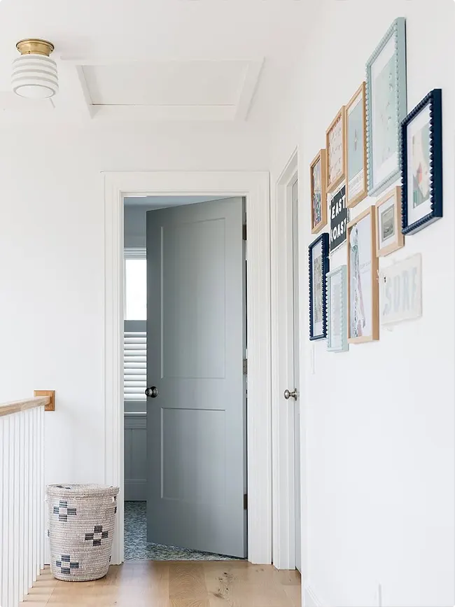
This hallway uses a mix of natural wood, navy blue, and soft aqua frames. The different sizes create visual interest without feeling too planned.
Start by picking two or three frame colors that complement your space. Then play with the arrangement until it feels right.
The beauty here is how the frames climb up the wall next to the staircase. It draws your eye upward and makes the space feel bigger.
Vintage Posters On The Staircase Wall
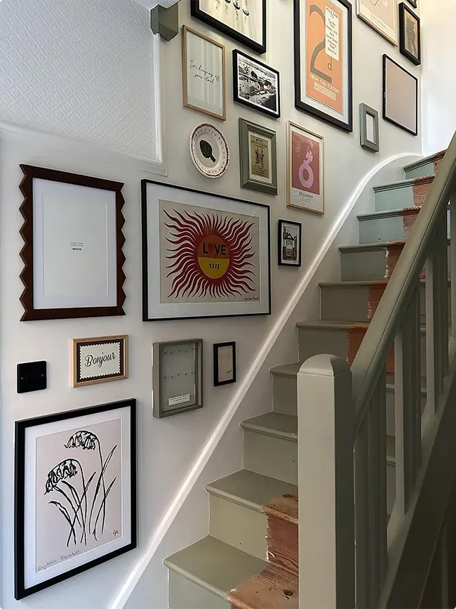
Forget matching frames. This staircase gallery mixes black frames with vintage prints and quirky art pieces.
The “Live On” sun print becomes a focal point, surrounded by smaller frames of different styles. Some are modern, some are retro, and somehow it all works together.
When you’re doing an eclectic wall like this, pick one larger piece as your anchor. Build around it with smaller pieces that share a color or vibe.
Black Frames In A Soft Gray Hallway
Sometimes simple is best. These black frames on pale gray walls create a clean gallery that doesn’t fight for attention.
The photos inside are black and white, which keeps everything cohesive. You can walk down this hallway without feeling overwhelmed.
I like how they placed a small console table below the frames. It adds function without taking up much space in a narrow hall.
Bold Statement With Black Trim
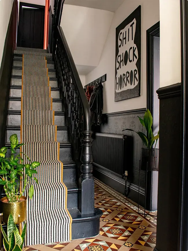
This hallway goes all in with black. Black staircase, black trim, even black radiator covers.
The oversized text art saying “Shit Shock Horror” becomes the main character here. It’s unexpected and makes you smile when you walk by.
That striped runner on the stairs ties everything together. The yellow edging picks up the warmth from those amazing floor tiles.
Colorful Art Gallery By The Staircase
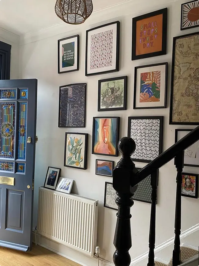
This wall tells a story with its mix of abstract art, patterns, and a “Small Steps Every Day” quote. Each frame has different colors but they share the same black frames.
The artwork leans into warm oranges, greens, and earth tones. It feels collected over time rather than bought all at once.
Start with pieces you actually love. The arrangement can always be adjusted later, but genuine pieces make a real difference.
Farmhouse Wall With Words And Greenery
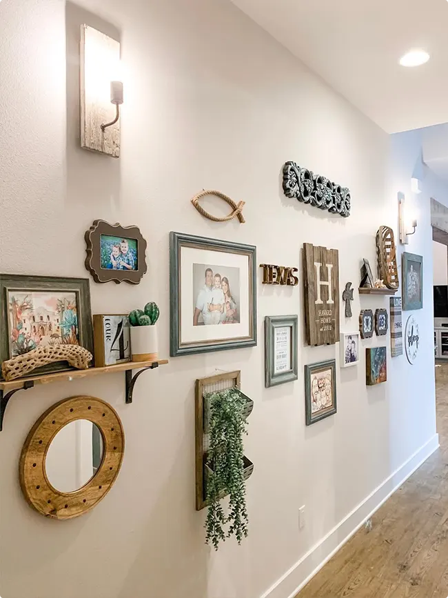
This hallway mixes frames with three-dimensional elements like wooden letters spelling “HOME” and “TEXAS.” There’s even a small shelf holding a floating plant.
The frames are mostly gray and natural wood tones. Some have family photos, others have little signs with quotes.
Adding shelves or ledges to your gallery wall gives you flexibility. You can swap things out without making new nail holes every time.
White On White With Family Photos
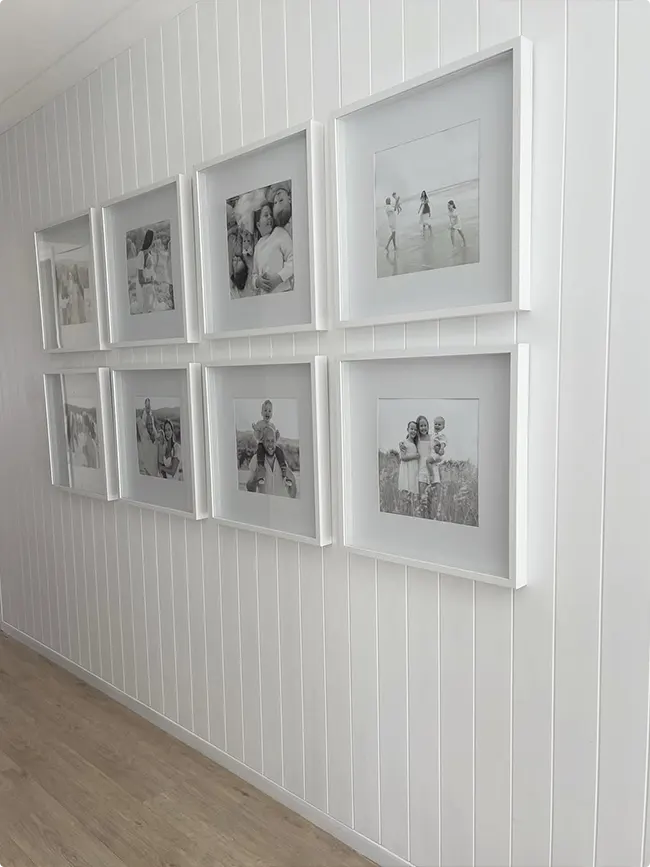
Eight white frames on white shiplap creates a clean, beachy look. The black and white photos inside keep it from feeling too plain.
This layout is perfectly symmetrical with two rows of four frames each. It’s satisfying to look at and easy to replicate.
For a wall like this, measure carefully and use a level. The symmetry only works if the spacing is consistent.
White Frames With Modern Lighting
This staircase wall uses all white frames in different sizes. They’re arranged in an asymmetric grid that feels balanced but not boring.
That modern bubble chandelier adds a fun element. It breaks up all the straight lines from the frames.
The mix of family photos and art prints keeps it personal. You’re not just looking at decoration, you’re seeing someone’s life.
Minimal Hallway With Natural Wood
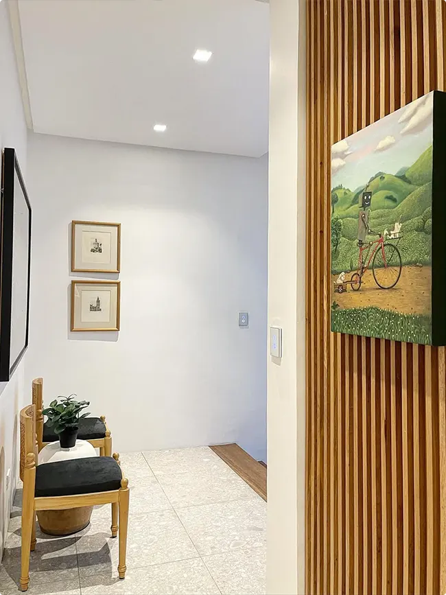
Just two small framed prints in simple wood frames. A wooden plant stand below holds a small plant and some rolled towels.
Sometimes less really is more. This hallway proves you don’t need twenty frames to make an impact.
The vertical wood slat accent wall on the right adds texture. The colorful bicycle print pops against all that natural wood.
Dark Wood Paneling With Pop Art
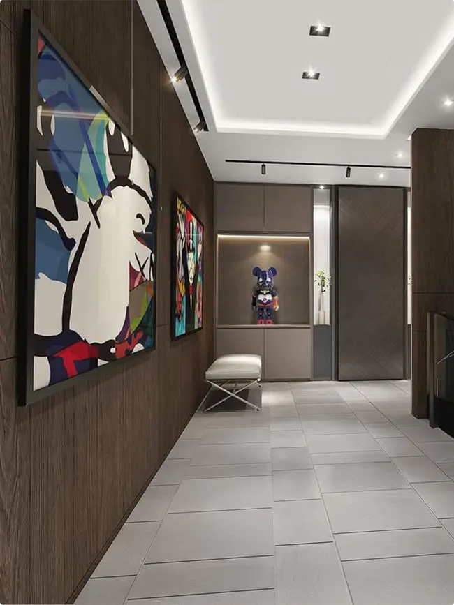
This hallway is fancy. Dark wood panels cover the walls, and the art is oversized and colorful.
The geometric pop art style contrasts with the traditional wood paneling. There’s even a collectible figure displayed in a lit niche at the end of the hall.
If you have architectural details like paneling or molding, lean into them. Make them part of your design instead of fighting against them.
Mixed Era Portrait Gallery
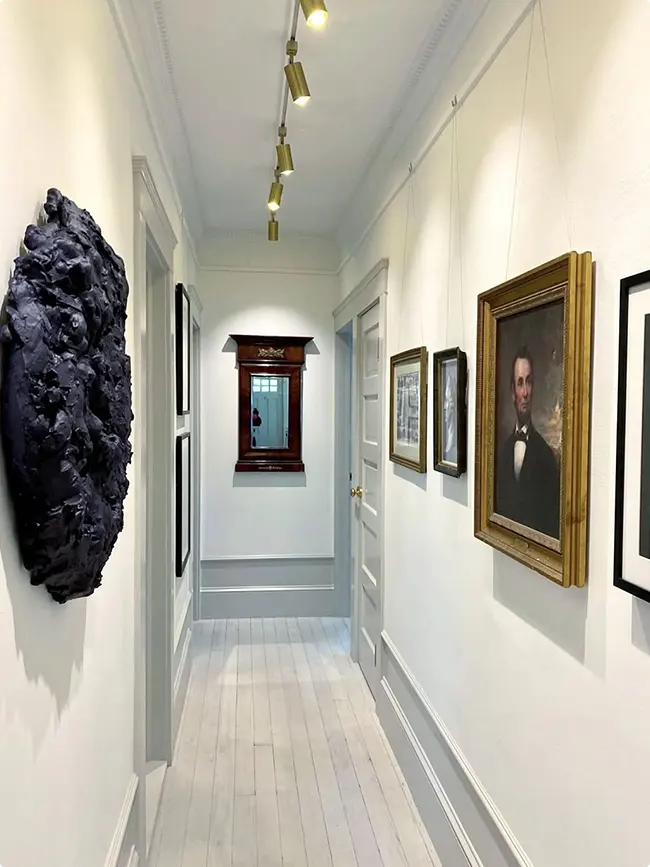
Old oil paintings hang next to modern black frames in this long hallway. There’s even a sculptural piece that looks like black rock on the left.
The gold frame around the vintage portrait stands out against all the black and white. It becomes a focal point without trying too hard.
Track lighting on the ceiling highlights each piece individually. Good lighting can make even budget frames look expensive.
Playful Prints With A Narrow Console
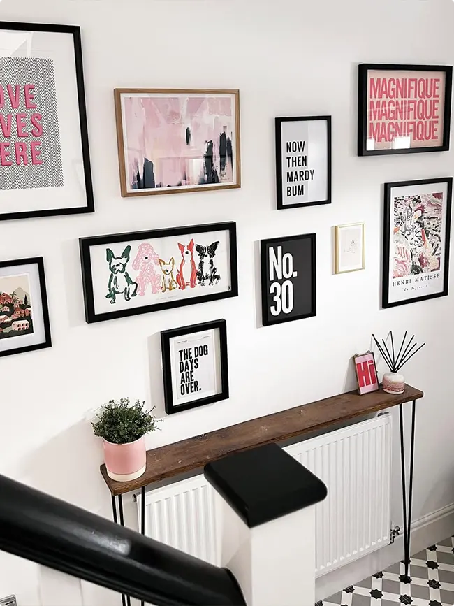
This staircase gallery mixes typography prints with dog illustrations and abstract art. The frames alternate between black and wood tones.
That narrow console table below is genius for tight spaces. It’s barely deeper than the radiator but still adds function.
The checkered floor tile at the bottom pulls your eye through the whole space. Every element works together without being matchy.
Vintage Botanical Prints Floor To Ceiling
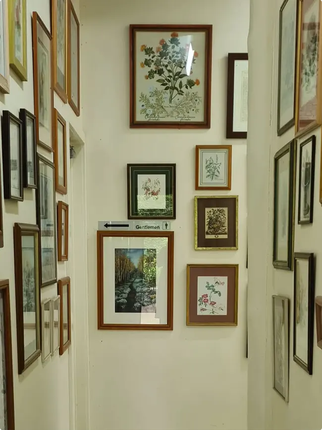
This narrow hallway is packed with botanical prints in wood and gold frames. They go all the way up to the ceiling on both sides.
The frames are different sizes but similar styles. It creates a collected, antique shop vibe.
A small “Gentleman” sign sits on a picture ledge, breaking up the botanical theme. Little unexpected touches like that keep things interesting.
Coastal Photography In Black Frames
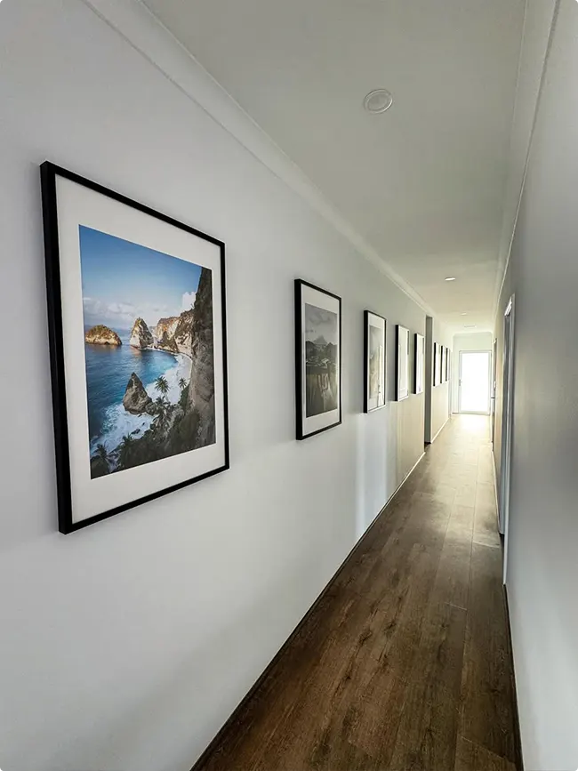
Five black frames line this long hallway, each holding a coastal landscape photo. The first one is noticeably larger than the rest.
This creates a leading line effect. Your eye follows the frames down the hallway naturally.
The matching frames keep it cohesive even though the photos are all different scenes. It’s like a mini photography exhibition in your home.
Clean Lines With Strategic Placement
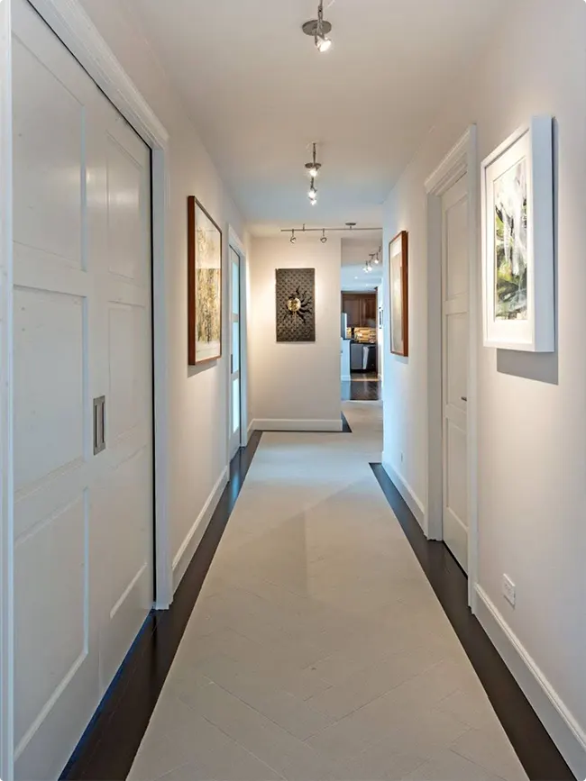
This hallway keeps the art minimal but intentional. A few wood-framed pieces on the left wall, and a decorative panel with gold accents at the end.
The dark wood trim along the floor creates a modern border. It’s an architectural detail that makes everything feel more finished.
Sometimes the hallway itself is the star. The art just needs to complement it, not compete with it.
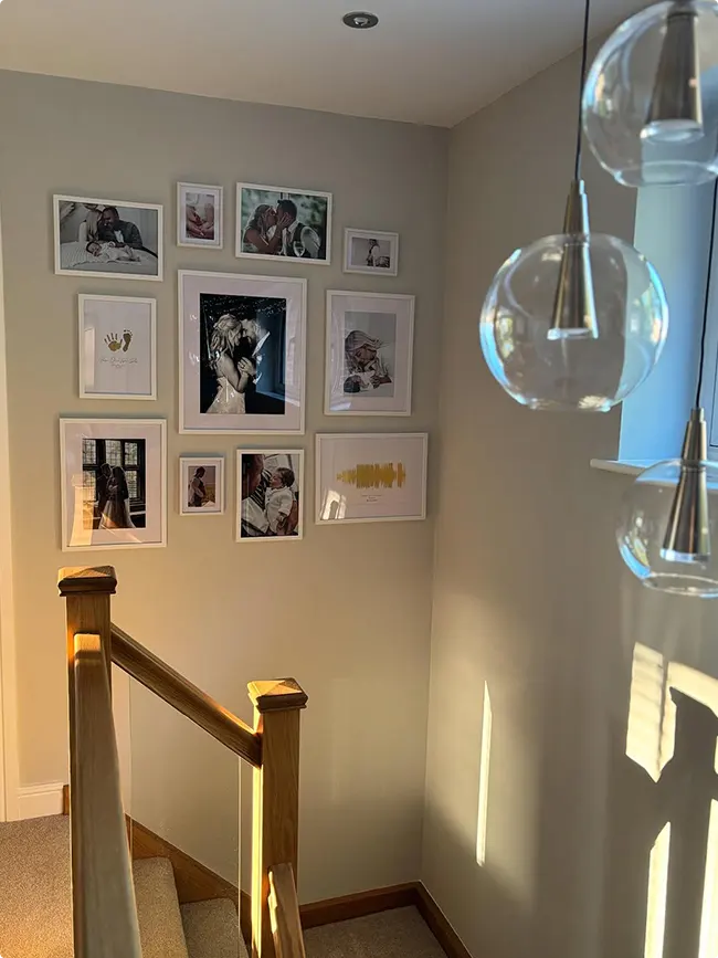
Romantic White Frame Cluster
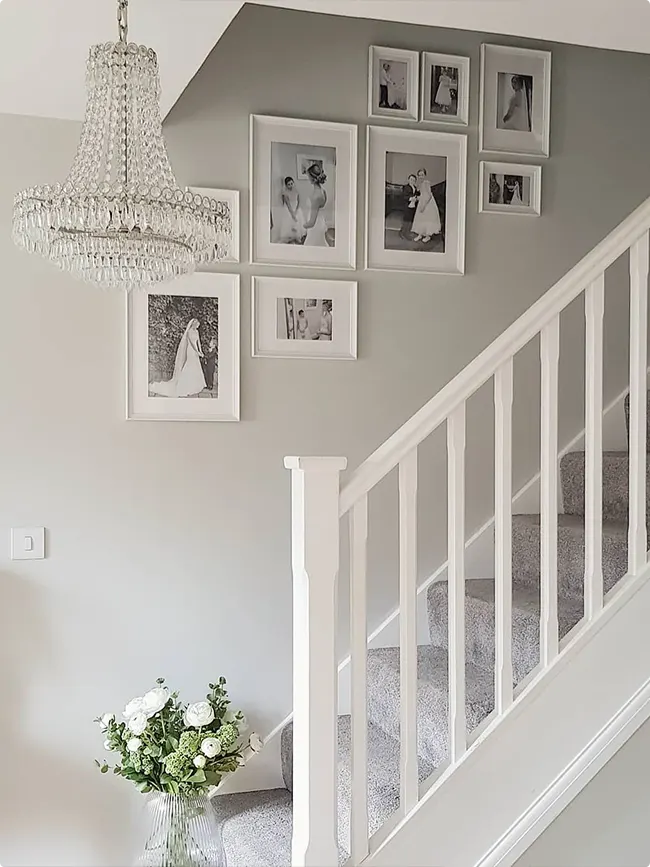
These white frames hold black and white wedding and family photos. They’re clustered together above the staircase in an organic shape.
The crystal chandelier adds elegance without being too fancy. Fresh flowers at the bottom of the stairs complete the romantic vibe.
This arrangement style works well when you want frames to feel like they’re floating together rather than in a strict grid.
Dark Accent Wall With Mixed Frames
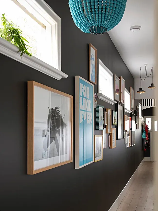
A charcoal gray wall makes all these frames pop. The mix of wood, white, and black frames creates depth and visual interest.
That turquoise beaded chandelier is the showstopper here. It adds color and personality to an otherwise neutral palette.
Dark walls can actually make small hallways feel cozier rather than smaller. The key is good lighting and lighter frames.
Maximalist Hallway With Ornate Details
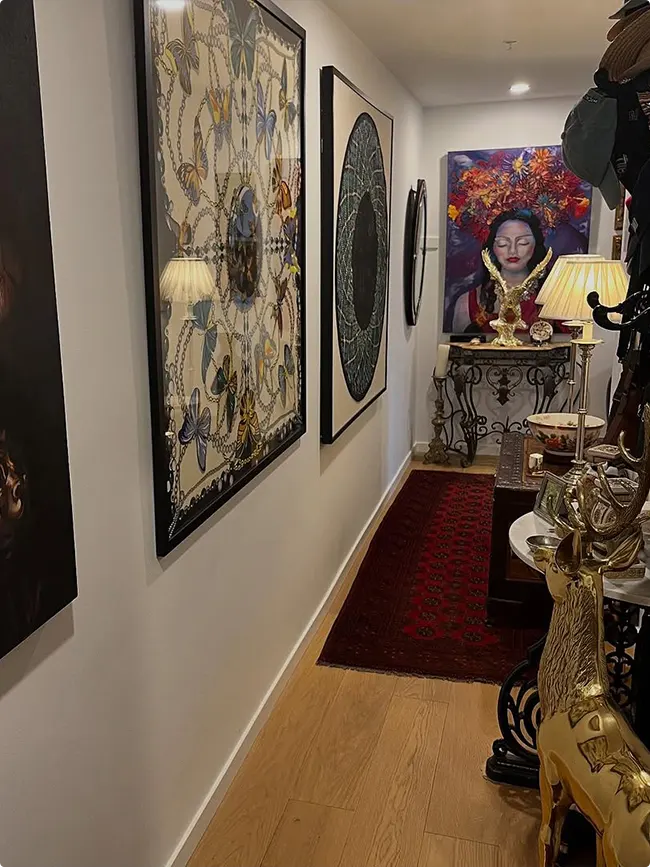
This hallway is all about drama. Large framed art pieces mix with table lamps, sculptures, and a red patterned runner.
The colorful portrait at the end of the hall draws you forward. Gold accents on the console table add richness.
When you’re going for a maximalist look, stick to a color palette. Here it’s reds, golds, and blacks that tie everything together.
Related Hallway Ideas:
If you’re looking for even more Hallway inspiration, be sure to check out these other posts by clicking on their titles below:
FAQs About Hallway Gallery Wall Ideas
How high should I hang pictures in a hallway?
The center of your frames should sit around 57 to 60 inches from the floor. That’s average eye level for most people.
But honestly, this changes if you’re doing a staircase gallery. Then you want to follow the angle of the stairs and keep consistent spacing between frames.
What size frames work best for narrow hallways?
Narrow hallways do better with smaller to medium frames. Think 8×10 or 11×14 inches.
Going too large makes the space feel cramped. You want people to actually walk through without feeling like they’re squeezing past your art.
Multiple smaller frames often work better than one giant piece in tight spaces.
Should all my frames match?
Not unless you want them to. Matching frames look clean and organized, which some people love.
But mixing frame styles and colors can add personality. Just pick two or three frame finishes max so it doesn’t get chaotic.
Black frames are basically neutral and go with everything. Start there if you’re unsure.
How do I arrange frames without making tons of holes?
Lay everything out on the floor first. Take a photo of the arrangement you like.
Then cut paper templates the same size as your frames. Tape them to the wall and adjust until it looks right.
Mark your nail holes through the paper, remove the templates, and hang. This saves you from a wall that looks like Swiss cheese.
Can I mix photos with art prints?
Absolutely. Mixing family photos with art prints or quotes makes your gallery wall more interesting.
The key is finding some common thread. Maybe it’s all black and white images, or they all share similar colors.
You don’t want it to look like two separate collections fighting for attention.
What’s the best lighting for a hallway gallery wall?
Natural light is great if you have windows. Just watch for direct sun that might fade your photos over time.
For artificial lighting, picture lights or track lighting work well. Even a few recessed ceiling lights aimed at the wall make a difference.
Good lighting turns okay frames into something special.
What do I do with a really long hallway?
Long hallways are actually perfect for gallery walls. You can tell a story as people walk through.
Consider doing frames on both walls if it’s wide enough. Or stick to one side and vary the frame sizes to create rhythm.
Break up really long stretches with a console table, plant, or decorative element. It gives the eye a place to rest.