There’s something about walking into a home that feels like it’s just steps from the shore—even if it’s nowhere near water.
That breezy, laid-back vibe we crave from a coastal interior isn’t just about the décor; it’s about the color palette that sets the tone for everything else. Trust me; Benjamin Moore‘s coastal paint colors perfectly nail that effortless beachy feel.
I’m personally drawn to the coastal look because it can completely transform a space. The right shade of blue or gray on the walls instantly makes a room feel brighter, more open, and, most importantly, more relaxing.
The thing is, though, you don’t need to overload your home with starfish motifs and seashell prints to get that effect. In fact, the best coastal interiors tend to steer clear of the obvious and lean into subtle color choices that evoke the sea and sky without screaming “beach house.”
Benjamin Moore offers a wide range of shades that do just that, from muted sea greens to soft sunset-inspired hues. Each color tells its own story, whether it’s capturing the gentle hues of a misty morning or the golden light of a beach at dusk.
When chosen thoughtfully, these coastal paint colors can completely change the energy of your home, making it feel like your own little slice of paradise—no matter where you live.
So, whether you’re looking to refresh a single room or redo your whole house, these 19 Benjamin Moore paint colors are your ticket to a serene, beach-inspired home. Let’s dive into the shades that will bring that coastal magic into your space.
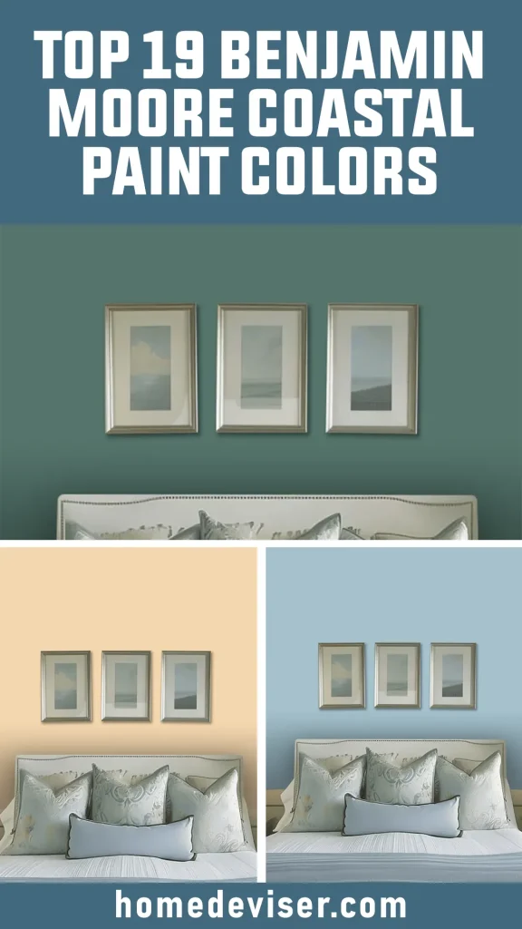
Best Benjamin Moore Coastal Gray Paint Colors
When it comes to creating a coastal vibe in your home, nothing beats the subtle beauty of gray tones. These shades reflect the calm of overcast beach days, misty mornings, and the soft shadows of sand dunes. They’re versatile, adaptable, and always provide a sophisticated coastal feel.
1. Ashwood

Ashwood is the perfect blend of warmth and coolness. This gray has just enough beige in it to remind me of weathered driftwood. It’s not too stark, and it pairs perfectly with sandy tones or whites to mimic a serene beach setting. Ashwood is what you turn to if you want a neutral background that still carries a bit of warmth.
2. Pearl Gray

Pearl Gray feels like the early morning light on a foggy coastal day. It’s light, almost ethereal, with a touch of softness that keeps it from feeling too cold. I like how it reflects natural light, making spaces feel bigger and airier, just like those open spaces near the ocean.
3. Gentle Gray

Gentle Gray leans into a cooler tone. I can imagine this shade on the walls of a beach cottage that overlooks the water. It’s subtle, clean, and pairs beautifully with whites and soft blues, creating that classic coastal contrast without overwhelming the senses.
Top Coastal Blues
Blue is the cornerstone of any coastal palette. It brings the sky, the sea, and that breath of fresh air indoors. These Benjamin Moore blues range from light and dreamy to deeper, more reflective shades, making them perfect for any beach-inspired home.
4. Sweet Dreams

Sweet Dreams lives up to its name. It’s soft, peaceful, and feels like the color of the sky just before the sun rises. If you want a light blue that doesn’t overpower but still gives a fresh, coastal breeze vibe, this is the one.
5. Sweet Bluette

Sweet Bluette has a whisper of blue with a hint of lavender undertones. I find it works well in spaces where you want a bit more depth without committing to a bold color. It’s like a soft blue mist settling over your space—perfect for bedrooms or cozy nooks.
6. Beach Glass

Beach Glass is one of those colors that reminds me of wandering the shore, finding those smooth, weathered pieces of glass. It’s a blend of blue and green, bringing the perfect balance between the two. It’s a little moodier, but in a way that draws you in and makes you feel at peace.
7. Sea Glass

Sea Glass is slightly deeper than Beach Glass, leaning more toward green. This color feels like the moment the ocean meets the horizon. It’s cool, refreshing, and ideal for spaces where you want a soothing, restorative vibe. I’d pair it with natural materials—think rattan, driftwood, or soft linens.
8. Pebble Beach

Pebble Beach is a soft, muted blue-gray. It’s more grounded than some of the other blues, giving a hint of color without dominating a room. I like it in spaces where you want to create a relaxed, coastal atmosphere without relying on overly bright hues.
9. Mediterranean Sky

Mediterranean Sky is that deeper, richer blue that calls to mind clear, sunny days along the Mediterranean coast. It’s a bit more intense than the lighter blues but still carries that beachy, laid-back feeling. This would be perfect for an accent wall or a room that needs a touch of boldness without overwhelming the space.
10. Mediterranean Breeze

Mediterranean Breeze takes that same rich blue tone and softens it slightly. It’s more playful, and lighter, and reminds me of the bright coastal skies you’d see in the Mediterranean. I’d use this color in a space where you want to evoke both energy and calm at the same time.
11. Sea Reflections

Sea Reflections is a mid-tone blue that captures the depth of the ocean. It’s calm but has enough strength to make a statement. I love using this in spaces that feel naturally lit because it enhances the color, giving it a dynamic quality as the light shifts throughout the day.
Best Coastal Greens
Green brings the elements of coastal foliage into your home—the sea grasses, the mossy rocks, and the lush vegetation that fringes the shore. These shades capture the vibrancy and tranquility of coastal life.
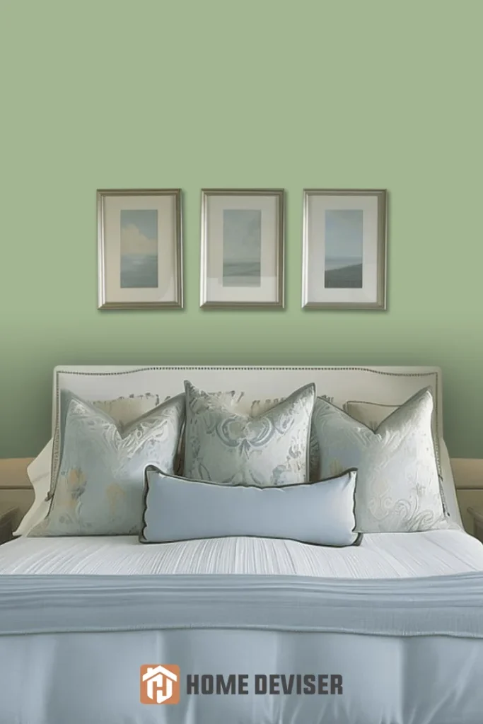
12. Par Four

Par Four is a gentle, muted green that makes me think of those soft grasses swaying in the wind on a dune. It’s subdued, yet carries just enough color to create a soothing atmosphere. I’d pair it with neutral tones to bring out its natural beauty.
13. Picnic Basket

Picnic Basket is a slightly cooler green with a subtle gray undertone. It reminds me of the sea’s reflection against the shoreline greenery. I like how versatile it is—equally perfect for kitchens, living rooms, or even bathrooms that want a coastal touch without being too obvious.
14. Sea Green
Sea Green is exactly what you imagine—the color of the ocean as it catches the sunlight. It has a perfect balance between blue and green, making it a great option if you want that coastal, aquatic feel. This would be great in spaces where you want to bring a little bit of the ocean indoors.
15. Verdigris

Verdigris is a bold choice—it’s deeper and more saturated than the others, with a moody vibe that feels like you’re walking along the coast during a storm. This color would work wonderfully in a more dramatic setting, perhaps as a feature wall in a living space or even a front door.
Popular Coastal Sunset Colors
Sunset colors evoke the magic of the golden hour at the beach. These hues bring warmth and a touch of romance to coastal spaces, balancing the cooler tones of blues and greens with a soft glow.
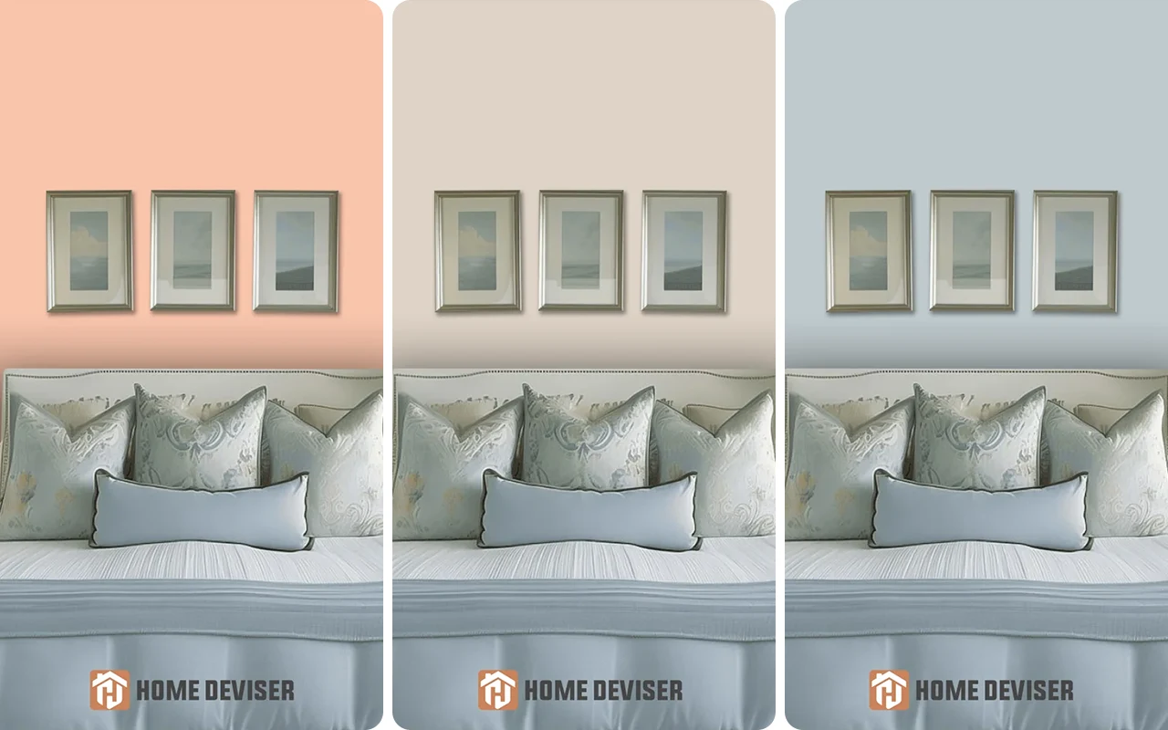
16. Frosted Toffee

Frosted Toffee is a soft, warm beige that reminds me of the last light of day hitting the sand. It’s a perfect transition color, ideal for spaces that need a bit of warmth without overpowering the coastal theme.
17. Chestertown Buff

Chestertown Buff brings in more depth with its golden undertones. This shade is like the light of a setting sun stretching across the horizon. It’s grounding and warm, pairing well with the cooler blues and greens to create a balanced, inviting space.
18. Manila

Manila feels like the golden sands of a sunlit beach. It’s light, warm, and uplifting without being too bold. This color works well in rooms where you want to reflect light and create a cozy, inviting atmosphere.
19. Sanibel Peach

Sanibel Peach is the color of the sky just as the sun dips below the water, leaving behind a soft peach glow. It’s a subtle, cheerful color that adds a hint of warmth to your coastal palette. I’d use this in spaces that need a little extra light or personality, without straying too far from the coastal theme.
Helpful tools if you are going to paint yourself
If you’re planning to take on a painting project yourself, having the right tools can make all the difference. They will help you achieve a more professional finish and will save you time and effort. Before you get started, make sure you’re equipped with these must-have items to make your DIY painting job easier and more efficient.
High-quality Paint Brush: This one costs a bit more, but it’s totally worth it. It will help you paint faster and more accurately. If you’re going to paint yourself, don’t skimp here. This one happens to be highly rated on Amazon as well.
Painter’s Tape: A must-have. Use for all the trim as well as ceiling area.
Paint Roller Kit: This includes a tray. Use the brush for the edges and the roller for the main areas of the wall (and ceiling).
Drop Cloths – Yes, you’ll need them for sure. Some people have some on hand, but often not enough if you are doing many rooms. If you’re painting multiple rooms, having plenty of drop cloths is a must.
Final Thoughts
I hope these Benjamin Moore Coastal Paint Colors inspire you as much as they inspire me.
Whether you’re looking to create a tranquil oasis with soft grays and blues or bring the warmth of a beach sunset indoors, these colors offer the perfect coastal palette.
Each shade captures the magic of the seaside in its own way, helping you transform your home into a space that feels calm, inviting, and connected to the ocean.
Happy painting!
Related Articles:
- Top 19 Behr Coastal Paint Colors for a Fresh Beachy Feel
- 27 Best Blue Gray Paint Colors for Home
- 13 Calming Paint Colors for Living Room
- What Paint Colors Make A Room Look Bigger?