
There’s something about blue gray paint colors that I keep coming back to. Maybe it’s the perfect blend of calm and sophistication, or maybe it’s because these shades can work anywhere—bedrooms, kitchens, even front doors.
When I first stumbled upon this color family, I was stuck between wanting something moody but not too dark, and modern but not too stark.
After experimenting with a few swatches, it became clear that blue gray is the sweet spot. It feels like a color that evolves with the light and mood of the space, which is exactly why I’ve gathered 27 of the best blue gray paint colors that truly stand out.
Each of these shades has its own personality, so I’m sure one will fit whatever room—or vibe—you’re going for.
What Are Blue Gray Paint Colors?
Blue gray paint colors are the perfect balance between the calm, cool tones of blue and the understated sophistication of gray. I’ve always found this color combination to be incredibly versatile. It’s one of those shades that feels both soothing and refined without being too loud or overwhelming. When I was first deciding on a color for my living room, I kept coming back to blue gray because it creates a soft, neutral backdrop but still has enough character to make a statement.
These colors work across different styles and settings—whether you’re aiming for a coastal vibe, a modern minimalistic look, or something a bit more traditional. They can shift with the light, appearing more blue or more gray depending on the time of day or the accents in the room. That’s part of the appeal for me: they’re dynamic, and yet they maintain a calming presence, making them ideal for spaces where you want to unwind or feel refreshed.
If you’re drawn to the tranquility of blue but don’t want it to dominate the room, blue gray strikes that perfect balance. It brings a hint of color without being overpowering, which is why I ended up choosing it for my home. It’s the kind of shade you won’t easily get tired of, offering both subtlety and depth.
Where Can You Use a Blue Gray Paint Color?
You can use blue gray paint just about anywhere in your home, and I mean that literally. I’ve used it in my bedroom, my kitchen, and even the bathroom, and it worked every single time. In the bedroom, a softer blue gray can create a serene and peaceful atmosphere that feels perfect for unwinding at the end of the day. It’s calming but not boring—like you’re surrounded by a cool breeze, if that makes sense.
When I painted my kitchen in a slightly darker blue gray, it gave the space this unexpected modern vibe. It wasn’t the typical white or cream kitchen, but it wasn’t so bold that it clashed with the cabinets or countertops either. In fact, it helped tie everything together in a way I didn’t anticipate. I’ve even seen people use it in dining rooms to bring in a bit of subtle elegance, and it works especially well if you have natural wood furniture or brass fixtures.
But the real surprise was how it looked in the bathroom. I wasn’t expecting much, but the way the light hit the walls made the blue gray look almost like the sky at dusk—soft and moody, perfect for a space where you want to relax.
So, in my experience, blue gray paint can adapt to different rooms and styles without feeling out of place.
How to Choose The Best Blue Gray Paint Color?
Choosing the best blue gray paint color isn’t as straightforward as you’d think. When I first started looking, I figured I’d just pick one that looked nice on the swatch and be done with it. Big mistake. What I learned quickly is that blue gray paint changes drastically depending on lighting, the time of day, and even the other colors in the room. I ended up testing several samples, and I’d definitely recommend doing the same before committing to a whole gallon.
First, think about the room’s natural light. In rooms with a lot of sunlight, blue grays can appear lighter and more airy, while in darker rooms, they can shift towards a more muted, almost stormy tone. When I painted my guest room, I didn’t take into account how little light it gets, and the blue gray I picked ended up looking much more like gray—beautiful, but not the vibe I was going for.
Another tip: consider what other colors you’re working with. Blue grays can have different undertones—some lean more blue, others more gray, and some even have a greenish tint. I made the mistake of picking a shade with a green undertone that clashed with my couch cushions, so I had to start all over. Now, I always hold up paint samples next to my furniture and decor to make sure everything plays nice together.
Lastly, don’t rush it. Paint a couple of samples on your wall and live with them for a few days. You’ll notice how the color shifts with the light throughout the day, which will help you make a more confident choice. It’s worth the extra time to avoid the disappointment of a paint job that doesn’t feel quite right once it’s done.
Most Popular Blue Gray Paint Colors
Sherwin Williams – North Star

North Star has this soft, airy quality that feels perfect for a light and bright space. It leans more toward the gray side but has just enough blue to keep things interesting. I’ve seen it work beautifully in bedrooms and bathrooms where you want a calm, soothing vibe.
Sherwin Williams – Misty
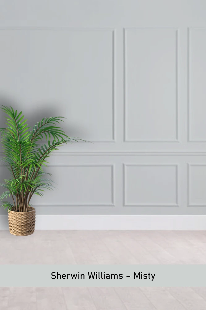
Misty is a subtle and versatile blue gray that has a certain coolness to it. It’s not in-your-face, making it ideal for open spaces like living rooms or hallways. I always recommend it if you’re looking for something neutral with a bit of personality.
Benjamin Moore – Boothbay Gray
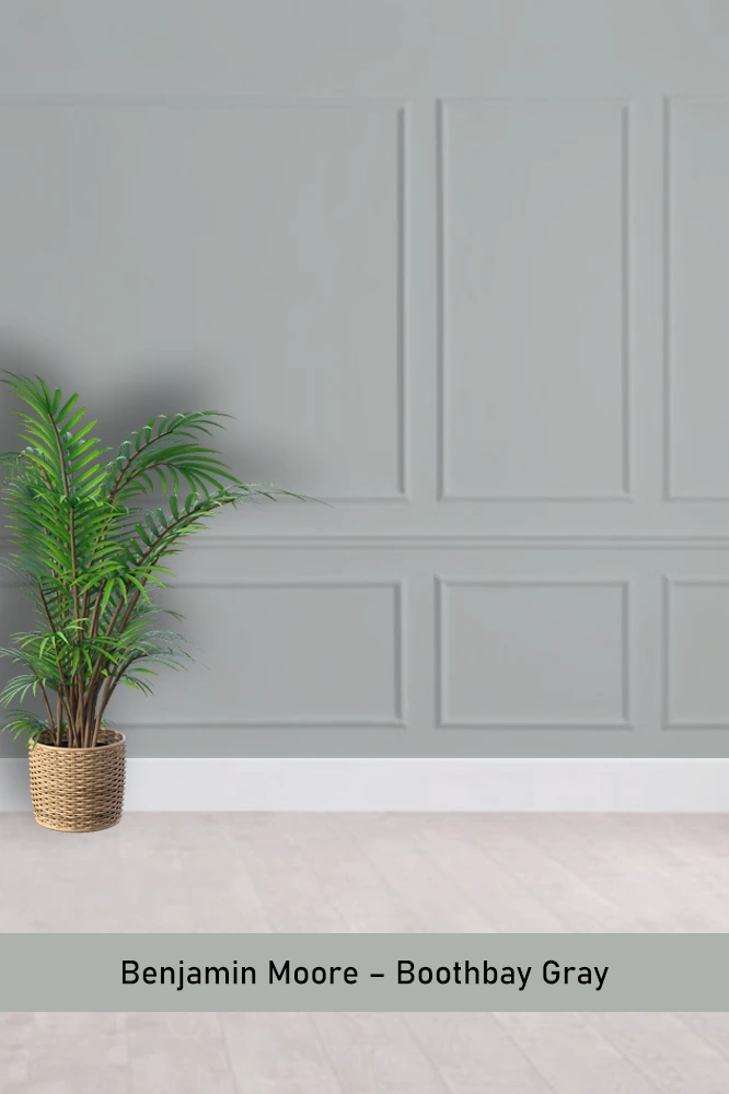
Boothbay Gray is one of those colors that shifts dramatically depending on the light. In the daytime, it reads more blue, while at night, the gray undertones take over. I’ve found it works really well in rooms with lots of natural light.
Sherwin Williams – Hinting Blue
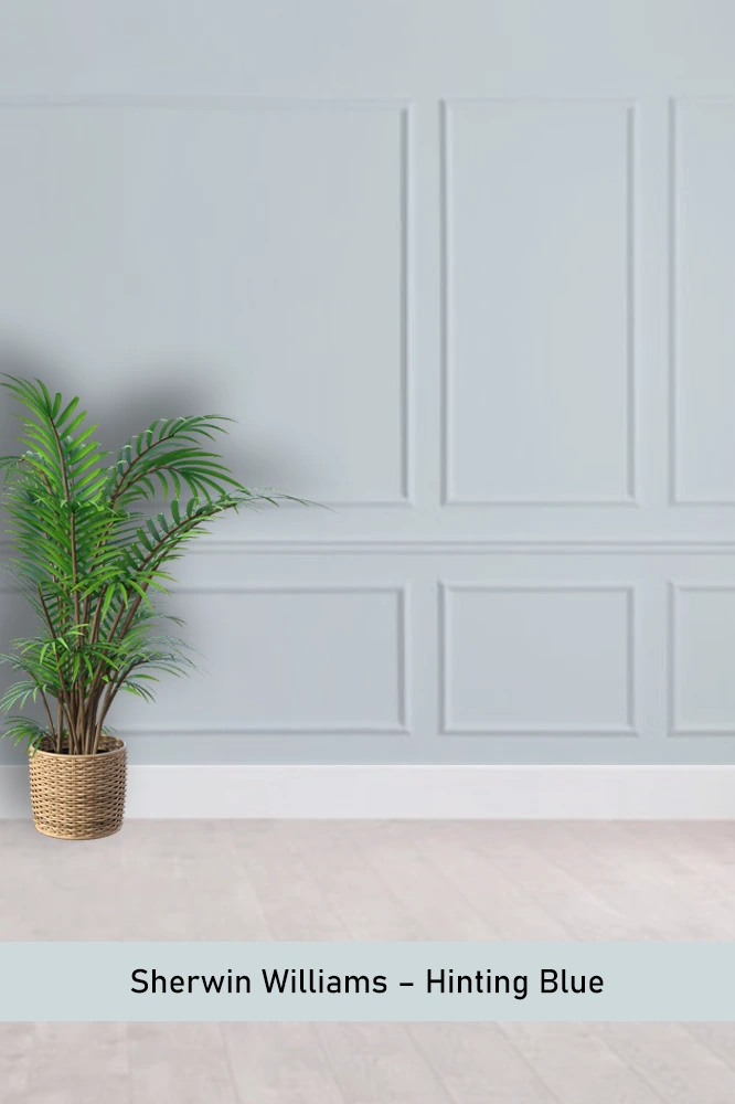
Hinting Blue is almost like a whisper of blue with a gentle gray base. It’s perfect if you want a hint of color without overwhelming the room. I used it in a small office, and it made the space feel open yet cozy.
Benjamin Moore – Smoke
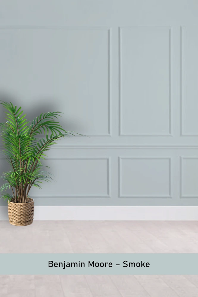
Smoke is a rich, moody blue gray with a smoky, almost silvery quality to it. It’s great for adding depth to a space. I’ve seen it paired with darker wood tones, and the contrast is stunning.
Benjamin Moore – Santorini Blue
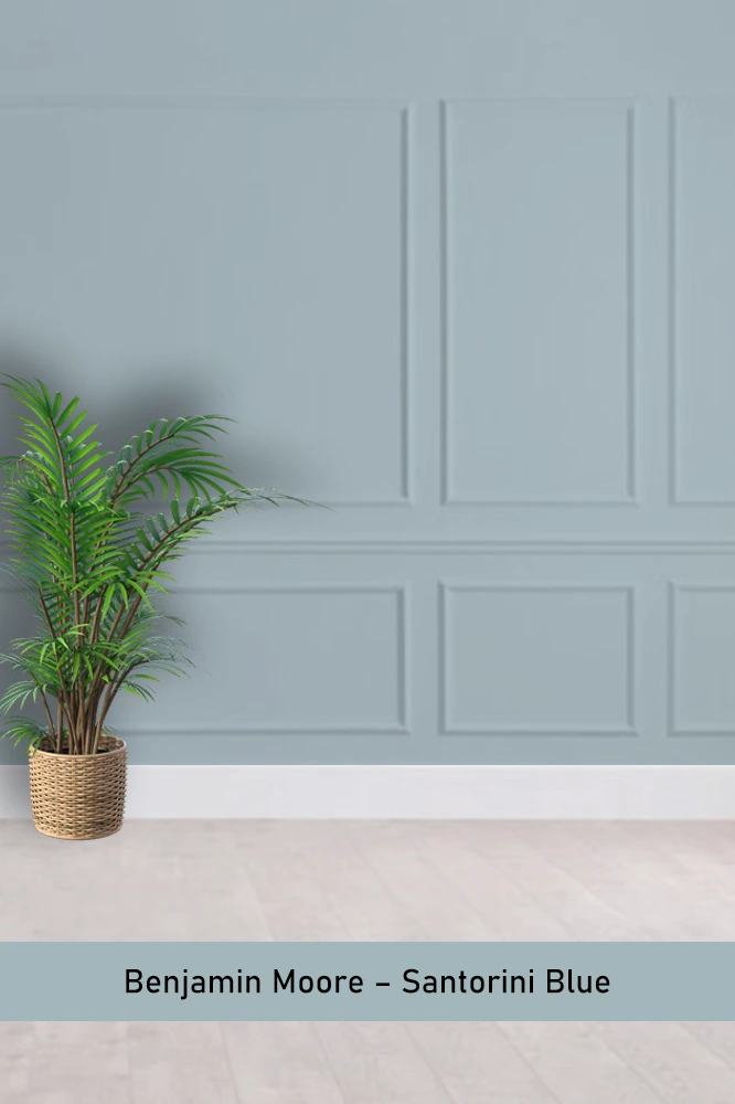
Santorini Blue has a coastal feel without being too beachy. It’s a bit brighter and bolder than most blue grays, making it a good choice for accent walls or even cabinetry if you want to add some energy to the room.
Behr – Intercoastal Gray
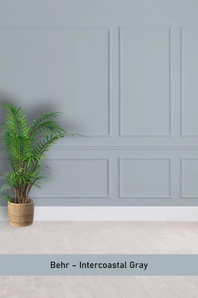
Intercoastal Gray is one of those flexible shades that works just about anywhere. It’s the perfect blend of blue and gray, and I’ve seen it in everything from modern kitchens to traditional bedrooms. It’s a safe bet if you’re unsure.
Sherwin Williams – Dockside Blue
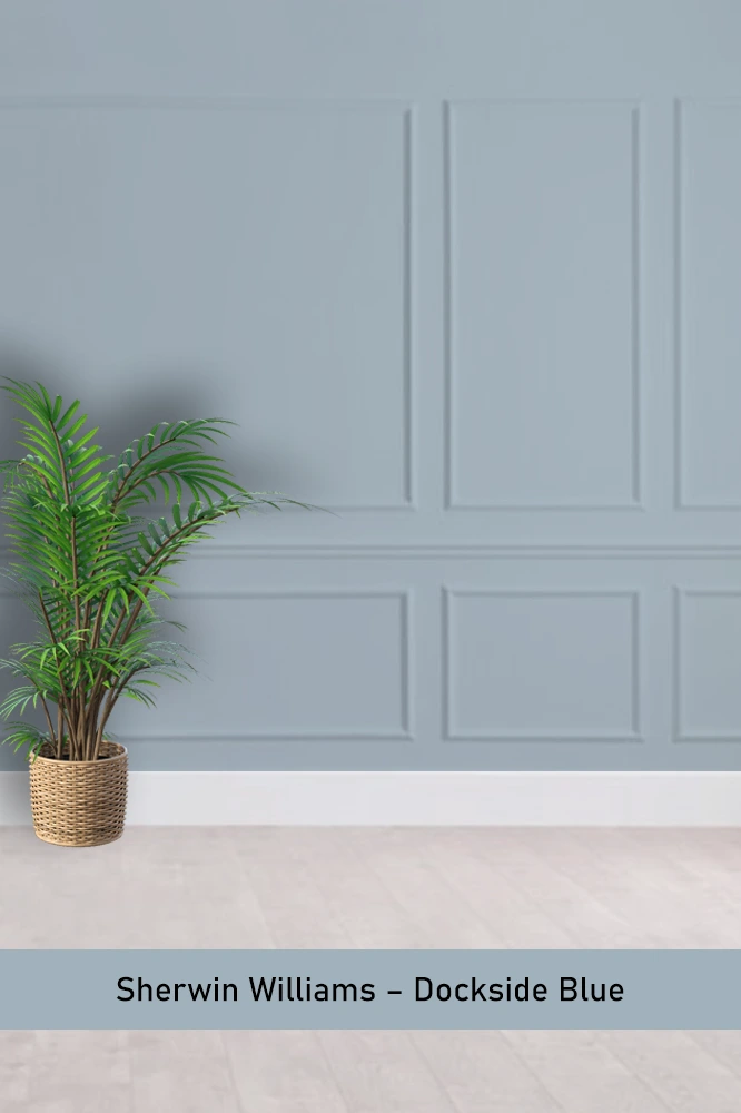
Dockside Blue has a stronger blue presence but is still softened by its gray undertones. It’s perfect if you want a more vibrant look without going full navy. I love it in spaces that need a bit of a punch without being too loud.
Benjamin Moore – Bachelor Blue
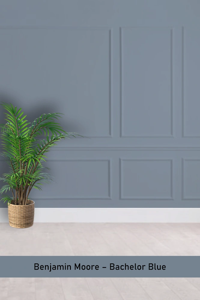
Bachelor Blue is a moody, darker blue gray that almost feels like a stormy sky. I’ve seen it used in home offices and libraries where you want to create a more serious, contemplative atmosphere.
Sherwin Williams – Poolhouse
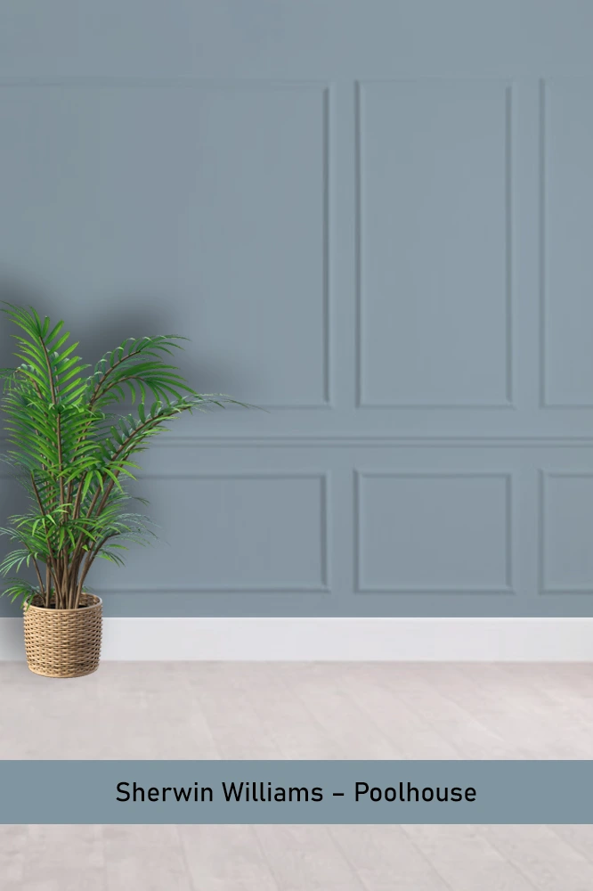
Poolhouse is a mid-tone blue gray that strikes a great balance between light and dark. It’s ideal for rooms that need a bit of depth but still want to feel fresh and welcoming. I’ve used it in a guest room, and it was a hit.
Benjamin Moore – Water’s Edge

Water’s Edge leans slightly more blue but still has that grounded gray feel. It’s great for spaces where you want a bit of color without going too bold. I especially like it for bedrooms or any space meant for relaxation.
Sherwin Williams – Bracing Blue
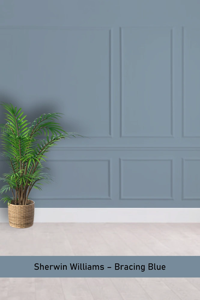
Bracing Blue is more of a bold, cool blue with a hint of gray. It’s great for making a statement, especially in living rooms or dining rooms where you want a more sophisticated yet dramatic feel.
Sherwin Williams – Storm Cloud
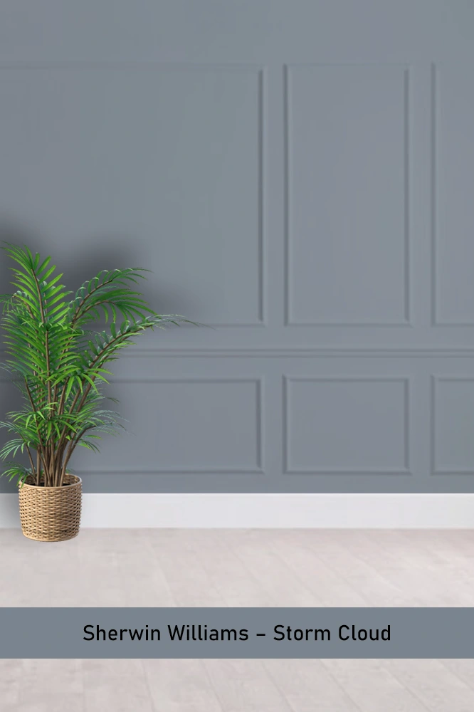
Storm Cloud is a deeper, more intense blue gray that’s perfect for making a space feel cozy and intimate. I used it in a den once, and it gave the room this wonderfully moody, cocoon-like atmosphere.
Sherwin Williams – Grays Harbor
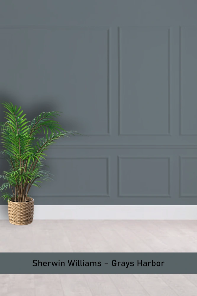
Grays Harbor is a dark, almost navy blue gray. It has a rich, sophisticated feel that works well in spaces like home offices or dining rooms. It’s bold but not overwhelming, making it a strong color choice for a focal wall.
Benjamin Moore – Blue Note
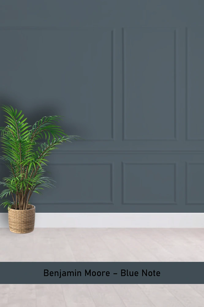
Blue Note is a darker, inky blue gray with a luxurious depth to it. It works best in formal settings like a dining room or entryway where you want to create an impression of elegance and drama.
Sherwin Williams – Krypton
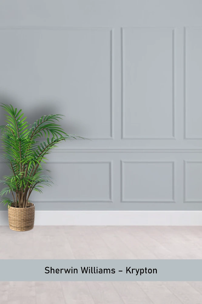
Krypton is one of those true-blue grays that reads cooler but doesn’t feel cold. I love it for kitchens or bathrooms where you want a clean, crisp feel without it looking sterile.
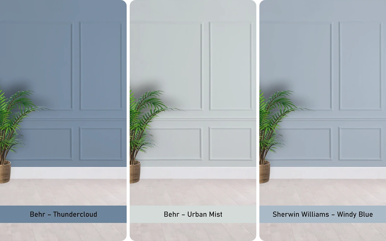
Sherwin Williams – Windy Blue
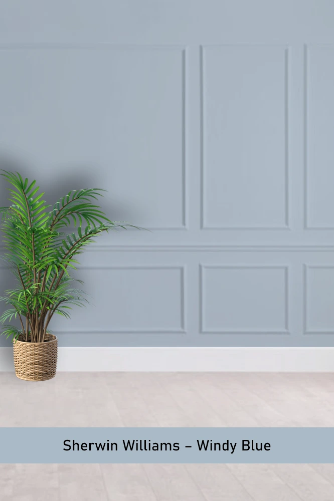
Windy Blue is soft and breezy, perfect for spaces where you want to feel open and light. I’ve seen it in nurseries and living rooms, and it always gives off this calming, serene vibe.
Sherwin Williams – Passive
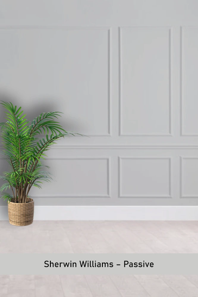
Passive is more of a soft gray with just the faintest touch of blue. It’s perfect for those who want a barely-there color but still want something with a bit of coolness. I’ve used it as a backdrop for bolder accent colors, and it worked great.
Benjamin Moore – Sterling
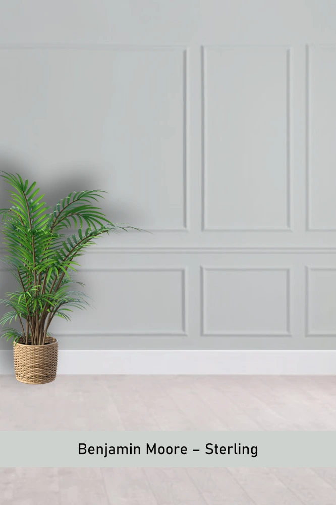
Sterling has a clean, silvery quality to it with just a hint of blue. It’s a great neutral that works almost anywhere. I particularly love it in modern, minimalist spaces where you want the walls to stay understated but still interesting.
Behr – Thundercloud
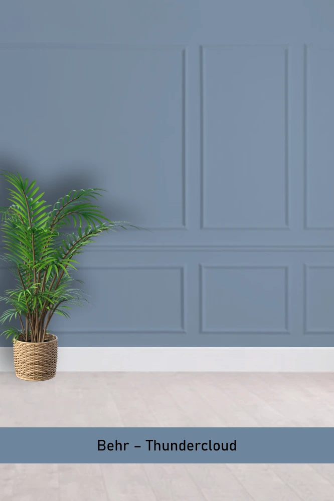
Thundercloud is a mid-tone blue gray that feels grounded and approachable. It’s a solid choice for a living room or bedroom where you want something soothing but with enough presence to hold the room together.
Sherwin Williams – Granite Peak
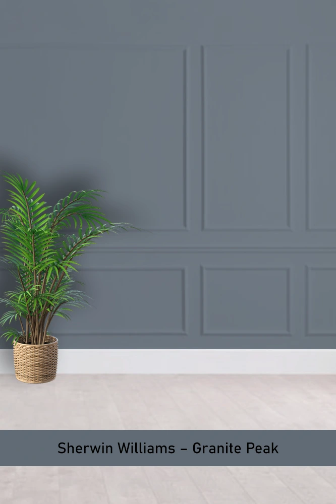
Granite Peak is a rich, dark blue gray that feels bold and dramatic. It’s a perfect choice for accent walls or spaces where you want to create a bit of moodiness. I’ve used it in a dining room, and it really set the tone.
Benjamin Moore – Flower Box
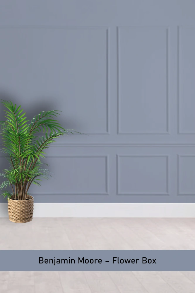
Flower Box is a deep, more saturated blue gray with a strong presence. It’s ideal for those looking to make a statement, whether in a home office or as an accent wall. It feels bold but still refined.
Benjamin Moore – Stillwater
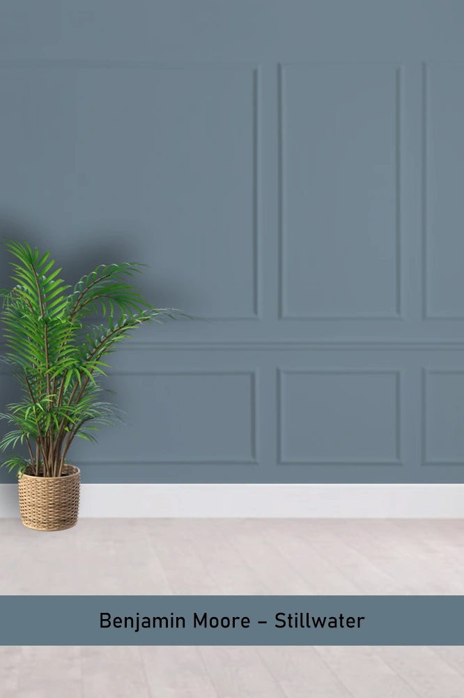
Stillwater is one of those darker blue grays that has a lot of depth to it. It’s great for cozy spaces like dens or libraries where you want to create an intimate, enveloping atmosphere.
Behr – Ozone
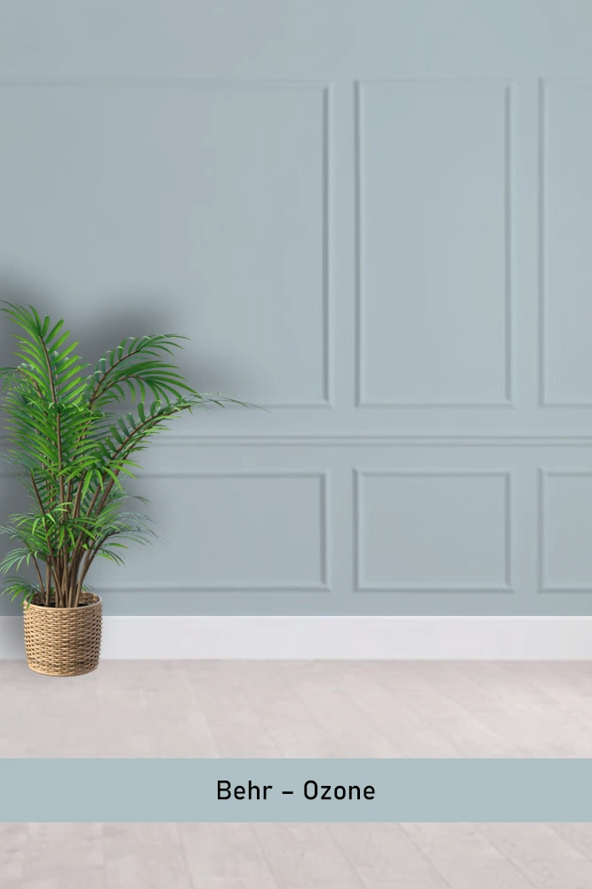
Ozone has a more modern, sleek look with its cooler undertones. It’s perfect for contemporary spaces that need a bit of color without going overboard. I’ve seen it in kitchens, and it pairs beautifully with stainless steel appliances.
Behr – Urban Mist
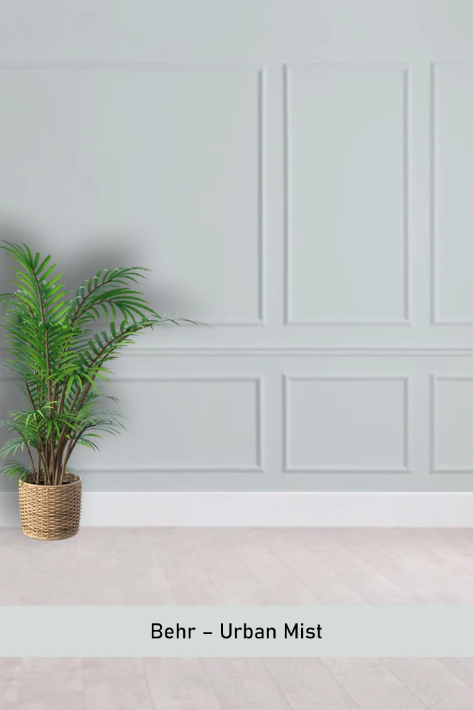
Urban Mist is a light, airy blue gray that’s perfect for bright, open spaces. It doesn’t feel too heavy or serious, making it a great choice for living rooms or even a home office where you need a calm, focused environment.
Sherwin Williams – Daphne
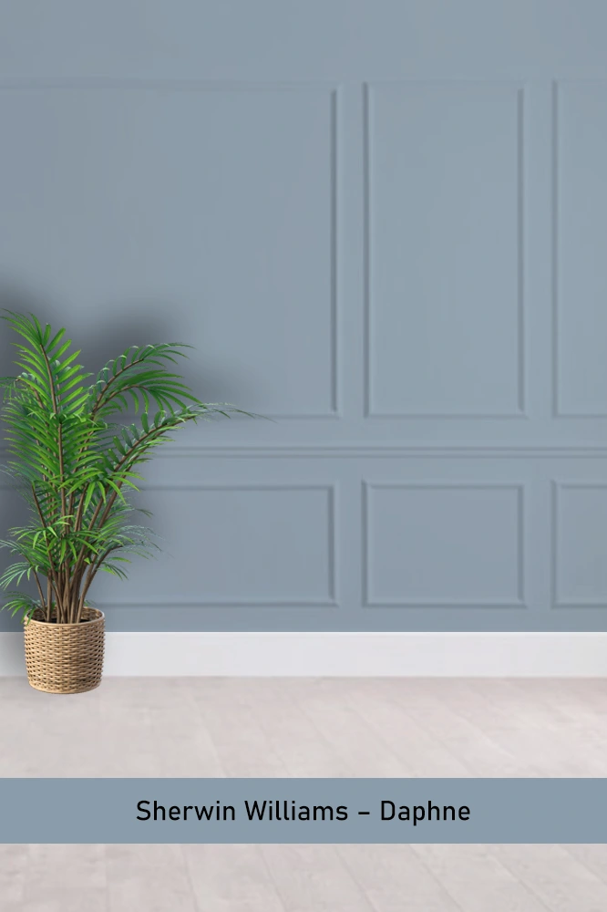
Daphne is a slightly more vibrant blue gray, with a richness that stands out. It’s perfect if you want a touch more color in your space but still want something grounded in neutral tones.
Farrow & Ball – De Nimes
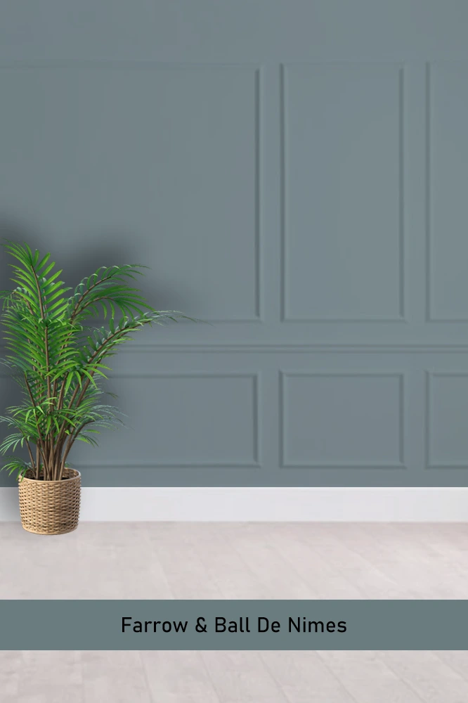
De Nimes is a sophisticated, muted blue gray that has a timeless quality to it. It feels elegant without being too formal, making it a great choice for any room where you want a classic yet modern look.
Helpful tools if you are going to paint yourself
If you’re planning to take on a painting project yourself, having the right tools can make all the difference. They will help you achieve a more professional finish and will save you time and effort. Before you get started, make sure you’re equipped with these must-have items to make your DIY painting job easier and more efficient.
High-quality Paint Brush: This one costs a bit more, but it’s totally worth it. It will help you paint faster and more accurately. If you’re going to paint yourself, don’t skimp here. This one happens to be highly rated on Amazon as well.
Painter’s Tape: A must-have. Use for all the trim as well as ceiling area.
Paint Roller Kit: This includes a tray. Use the brush for the edges and the roller for the main areas of the wall (and ceiling).
Drop Cloths – Yes, you’ll need them for sure. Some people have some on hand, but often not enough if you are doing many rooms. If you’re painting multiple rooms, having plenty of drop cloths is a must.
Final Thoughts
I hope these blue gray paint colors inspire you as much as they’ve inspired me. Whether you’re aiming for something light and airy or bold and moody, there’s a shade on this list that’ll hit just the right note.
I’ve found that blue gray adds a layer of depth without overwhelming a space, and it’s versatile enough to complement just about any style.
Hopefully, one of these colors will be the perfect backdrop for your next project!
If you’re anything like me, you’ll probably want to use them in more than one room.