
Two-tone bathrooms have this nice little trick. They make a space feel layered and styled without needing a million decorations everywhere. A darker color on the bottom, something soft on top, maybe a tile line right in the middle… suddenly the whole bathroom feels more thoughtful. Funny how paint can do that, right?
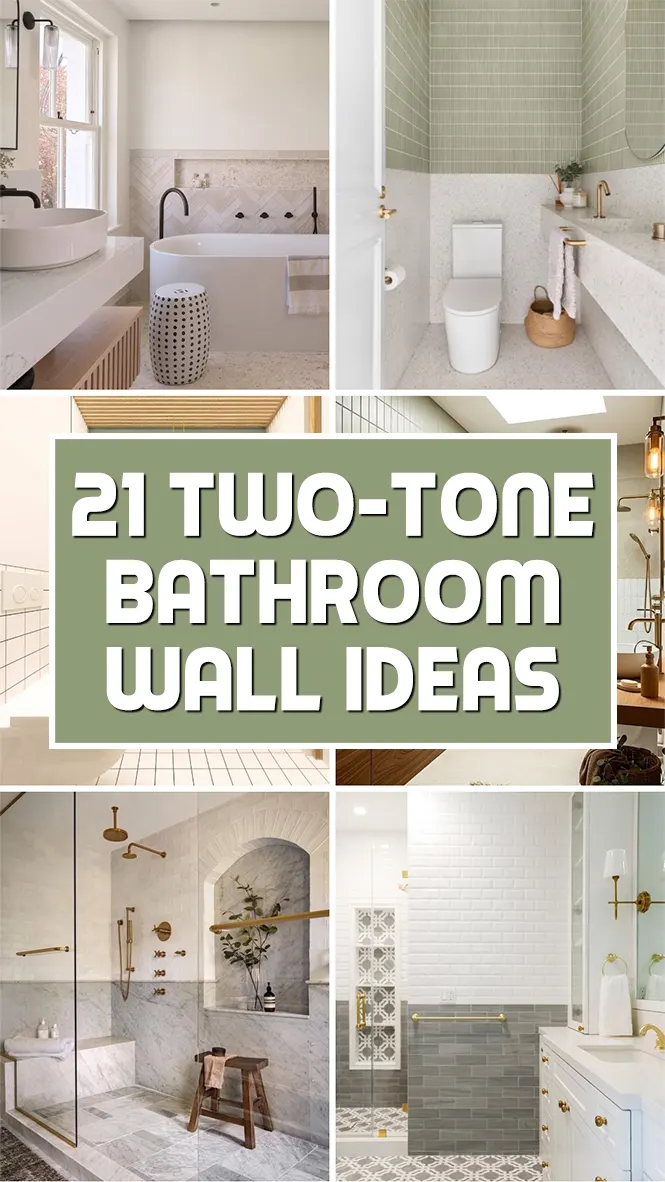
I also love that this look works in almost every style. Modern bathrooms feel cleaner with sharp color contrast. Farmhouse spaces feel cozy with warm neutrals and wood. Even tiny powder rooms somehow look more expensive when the walls are split into two tones. It’s one of those design ideas that looks fancy but is actually pretty doable on a weekend.
Some people go bold with black and white. Others keep things soft with beige, sage, dusty blue, or creamy pink. Honestly, there’s no wrong way to do it. The fun part is figuring out where to divide the colors and what mood you want the room to have.
And small tip? Trim pieces, molding, and tile borders make the transition look intentional. It’s the little details that pull everything together. I swear, even a simple bathroom starts looking custom after that.
Check out these two-tone bathroom wall ideas and find one that makes you want to grab a paintbrush.
Also Read: 23 Stylish Bathroom Shower Wall Ideas
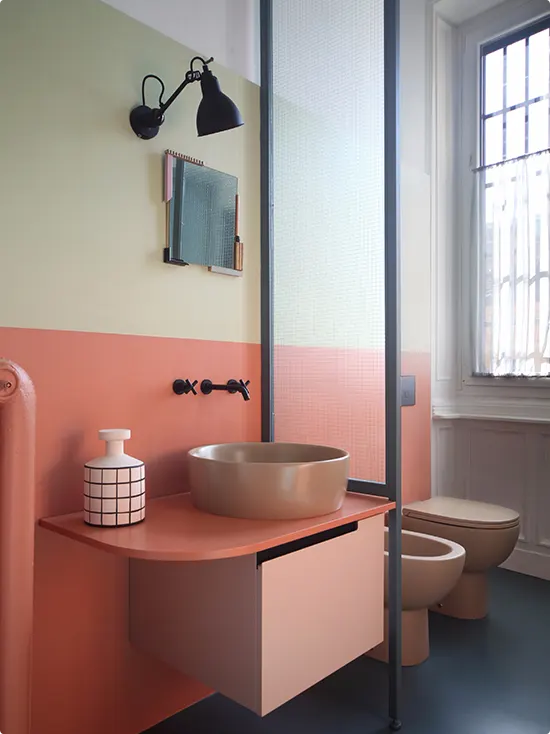
Pink Basin With Speckled Walls
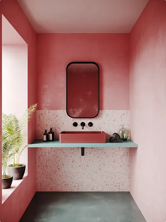
Pink walls already feel playful, but the speckled lower half makes this bathroom look even more custom and artsy. I really like how the darker rose tone wraps the room while the lighter terrazzo-style section keeps it from feeling too heavy.
The floating vanity shelf is simple, which honestly helps the colors stand out more. And that black mirror frame? Such a smart little contrast. It keeps all the pink from turning overly sweet.
This is the kind of bathroom that proves two-tone walls do not always need sharp contrast. Sometimes staying in the same color family works even better.
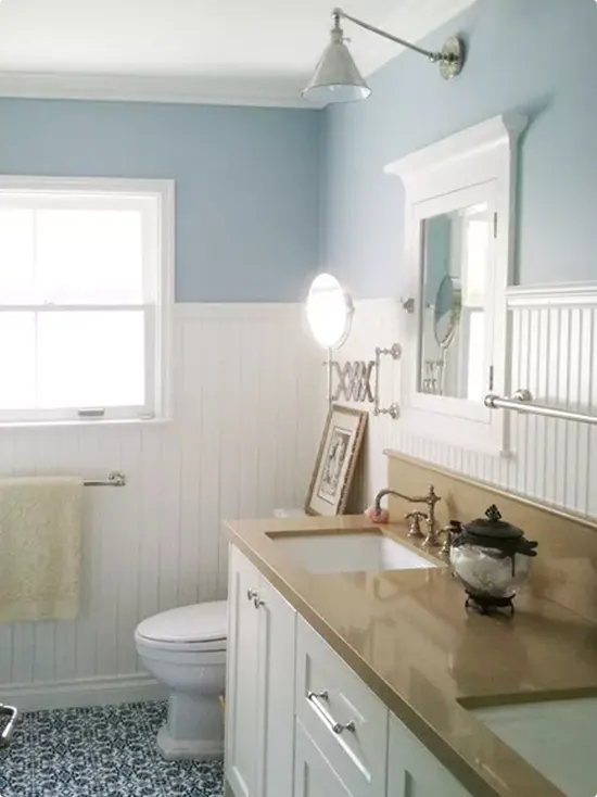
Soft Blue Walls With White Subway Tile Wainscoting
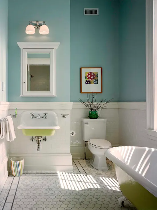
Soft teal walls paired with crisp white tile on the lower half — this is a combo that just makes mornings feel better, I swear.
The white tile wainscoting keeps things grounded and clean, while the blue above adds this easy, breezy personality that feels like a weekend by the water.
The clawfoot tub with green accents on the bottom ties everything together without trying too hard. Small pops of color in the art and the striped trash can keep it from feeling too matchy-matchy.
If you have a vintage-style bathroom or just want something that feels light and cheerful, this kind of two-tone setup is really hard to get wrong.
White With Sage Tile Backsplash
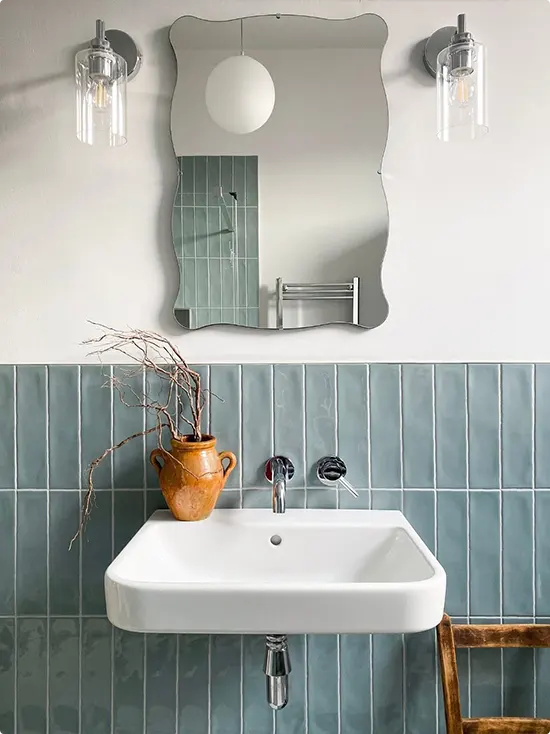
The sage green vertical tiles on the lower half of this wall are what grab you first.
They have this soft, slightly muted tone that feels really calm and natural. The upper wall stays plain white, which lets the tile do all the talking.
That wavy frameless mirror is chef’s kiss — it’s playful without being loud. Pair it with clear glass sconce lights and a simple wall-mount sink, and you’ve got a bathroom that feels like it belongs in a boutique hotel.
The little terracotta vase with dry branches adds just enough warmth so the space doesn’t feel too cold or minimal.
Herringbone Tile With Cream Wall
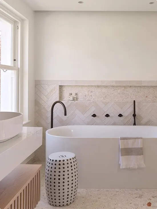
This one is for people who love texture more than color.
The lower portion of the wall is covered in a creamy herringbone tile, and the upper half is a smooth warm white plaster. It’s technically two tones, but the real magic is in the contrast of textures — rough meets smooth.
The matte black faucets are a perfect accent against all that softness. And the spotted ceramic garden stool beside the tub? That little detail makes the whole thing look styled, not staged.
Terrazzo flooring pulls it all together with tiny flecks of color that match the warm tones in the tile.
Also Read: 19 Neutral Shower Tile Ideas
Rust Red Walls With Vertical White Subway Tile
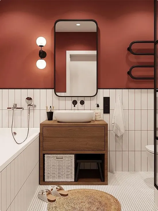
If you’ve been wanting to try a bold, saturated color in the bathroom, this is your sign.
The upper walls are painted in a deep rust-red terracotta shade that feels warm and energizing. The lower half has white vertical subway tiles that keep things from feeling too heavy.
A walnut vanity with a woven storage basket adds texture at eye level, and the matte black mirror and fixtures tie everything together.
Honestly, this bathroom feels like it woke up and chose confidence. The jute rug on the floor softens it just enough so it doesn’t feel intense when you walk in.
Sage Beadboard With Geometric Wallpaper
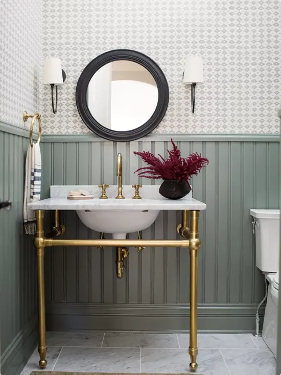
This is the bathroom that made me fall in love with beadboard all over again.
Sage green painted beadboard on the lower half gives the space this vintage, cottage-y feel. Above it, a soft geometric white-on-white wallpaper adds subtle pattern without being too busy.
The gold console sink with marble countertop is the real showstopper — it looks antique and elegant at the same time. A black round mirror and white sconces balance out all those warm gold tones.
The deep burgundy plant in the vase on the counter is such a smart color choice. It pops against the green without clashing at all.
Sage Green With White Subway Tile and Wood Vanity
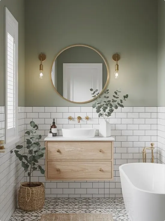
This one just feels right.
Sage green paint on the upper walls, white subway tiles on the lower half — it’s simple, but it works so well. The warm wood floating vanity brings in that earthy, natural energy that’s everywhere right now.
Gold fixtures throughout keep things from looking too rustic. And those eucalyptus stems in a white vase? A really easy way to bring the outdoors in.
The patterned floor tile at the bottom adds a nice surprise — it breaks up all that uniformity without feeling random. A potted plant in a woven basket on the floor finishes it off in the coziest way.
Marble Two-Tone Shower With Arched Niche
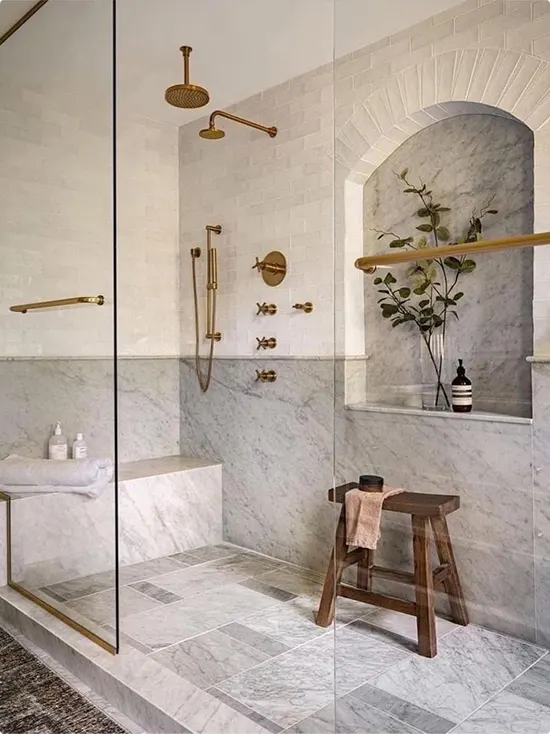
This one is giving full spa day.
The shower walls have a two-tone marble look — smaller white tiles up top and larger marble slabs down below. The shift in scale between the two sections creates this really rich, layered look without adding any color.
The arched niche inside the shower is a detail that really elevates the whole design. It’s lined with the same marble, and a little greenery inside makes it feel almost like a tiny garden.
Brushed gold fixtures throughout add just the right amount of warmth. A wooden stool in the corner is both useful and beautiful — honestly, the best kind of detail.
Blue-Gray Tile With White Wall
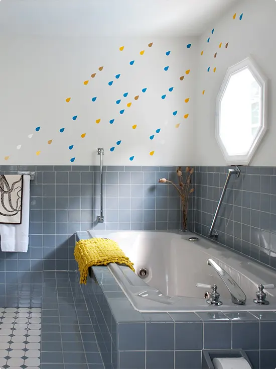
This one is playful and I love it.
The lower half of the wall is covered in blue-gray square tiles, and the upper white portion has hand-painted or sticker raindrop shapes in blue, yellow, and tan scattered across it. It sounds like it could be chaotic but it really isn’t.
It’s fun without being too childish, and it makes the whole bathroom feel lighter and more cheerful. A chunky yellow knit throw draped over the tub gives you a pop of warmth.
This is a great option if you want to add personality to a bathroom that already has tile you can’t or don’t want to replace. Just work with it and add something fun above.
Forest Green Tile With White Walls and Walnut Shelf
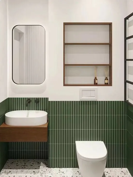
Green tile on the bottom half, crisp white walls on top — and it just works.
The forest green vertical tiles are bold but the white above them keeps the whole space breathing. A simple walnut floating vanity holds a round vessel sink, and a matching walnut open shelf built into the wall holds a few small amber glass bottles.
The terrazzo floor pulls in the green tones just slightly, which ties everything together without you even noticing at first. The black slim mirror and matte black faucet are clean and modern.
Sometimes less really is more, and this bathroom is proof of that.
Sage Tile With Terrazzo Vanity Counter
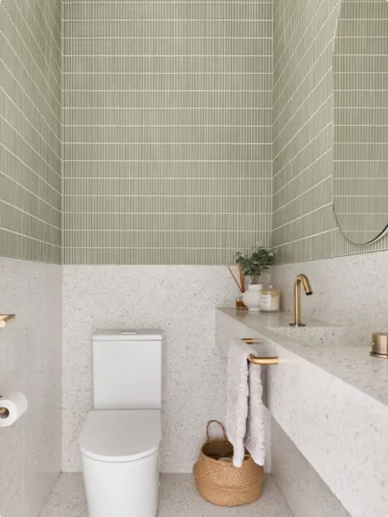
The top half here is soft sage green vertical tile and the bottom half transitions into a terrazzo-look surface that wraps the vanity and toilet area.
It’s a really interesting way to use two different materials as your two tones instead of just two paint colors. The textural contrast is subtle but it gives the space a lot of visual depth.
Gold hardware keeps things warm and modern. A woven basket on the floor tucked under the vanity is a practical touch that still looks good. The oval frameless mirror leans into that soft, rounded aesthetic throughout.
Charcoal Beadboard With Soft White Walls
Dark charcoal beadboard on the lower half, soft warm white on the upper half — this one is understated but really pulled together.
It’s a classic combo that works in almost any bathroom style. The wood plank floor adds warmth so the dark panel doesn’t make the space feel cold or heavy.
Edison bulb pendant lights over the mirror give it that old-world, slightly industrial edge. A pedestal sink keeps things simple and clean. It’s the kind of bathroom that looks polished with very little decoration.
Charcoal Upper Walls With White Subway Tile
This is flipped from what you usually see — the dark paint is on top and the white tile is on the bottom.
The charcoal walls above give this moody, dramatic feeling, while the white subway tile below keeps it feeling clean and grounded. White floating shelves on the dark wall are a clever way to add storage without losing the visual drama.
Globe pendant lights with silver hardware add a modern touch. The wood floor and dark bath mat warm up what could otherwise feel too cold.
If you want a bathroom that feels like a sophisticated escape, this one gets you there.
Blush Pink Upper Walls With Cream Tile
This one is elegant and a little unexpected.
Soft blush pink on the upper walls feels warm and romantic, while the vertical cream subway tiles below add a refined, almost Art Deco vibe. A dark charcoal vanity with gold legs breaks the softness just enough to keep it from feeling too sweet.
The round black-framed mirror perfectly frames the space, and the tall gold crystal wall sconces on either side feel genuinely luxurious.
A simple white vessel sink on a marble counter keeps the top of the vanity clean and uncluttered. A few amber glass bottles are all you need for styling here.
Green and White Tiles With Skylight Shower
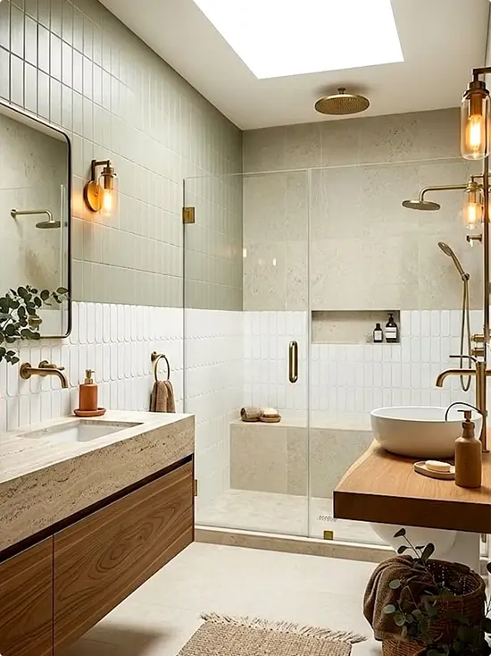
This bathroom has so much going on in the best possible way.
The upper section of the walls uses sage green vertical tiles, and the lower portion shifts to bright white textured subway tiles. The transition line runs right through the middle of the room and feels intentional and designed.
A skylight above the shower floods the whole space with natural light, which makes both tile colors look even better.
Warm wood cabinetry and gold fixtures keep the earthy, organic feel going. A wood shelf on the right with a bowl sink adds a spa-like corner that feels separate and special. The layered lighting — pendants, wall sconces, and that skylight — is doing a lot of heavy lifting here.
Baby Blue Walls With White Beadboard
Light, airy, and a little nostalgic — this bathroom feels like a cozy cottage.
Soft powder blue on the upper walls meets crisp white beadboard below. It’s a pairing that has been around for decades and honestly it just never gets old.
White cabinets with a warm beige countertop keep things classic. The silver swing-arm wall sconce adds that vintage detail that feels right at home here.
Blue and white patterned floor tiles complete the look and tie in the wall color all the way down to the ground. Simple, sweet, and really timeless.
Navy Wainscoting With Coastal Wallpaper
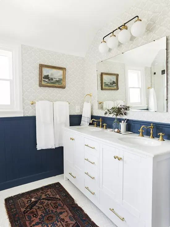
This is a bathroom that feels lived-in and loved.
Deep navy painted wainscoting on the lower half pairs with a soft, tone-on-tone coastal pattern wallpaper above. The contrast between the flat panel and the subtle wallpaper texture is really satisfying.
A large frameless mirror and white double vanity with gold hardware gives the space a clean, traditional backbone. The antique-style oil painting in a gold frame adds real character — it looks like it was always there, not just placed there for a photo.
A vintage Persian rug on the floor is the unexpected detail that makes the whole room feel layered and collected over time.
White Subway Tile With Gray Wainscoting and Gold Fixtures
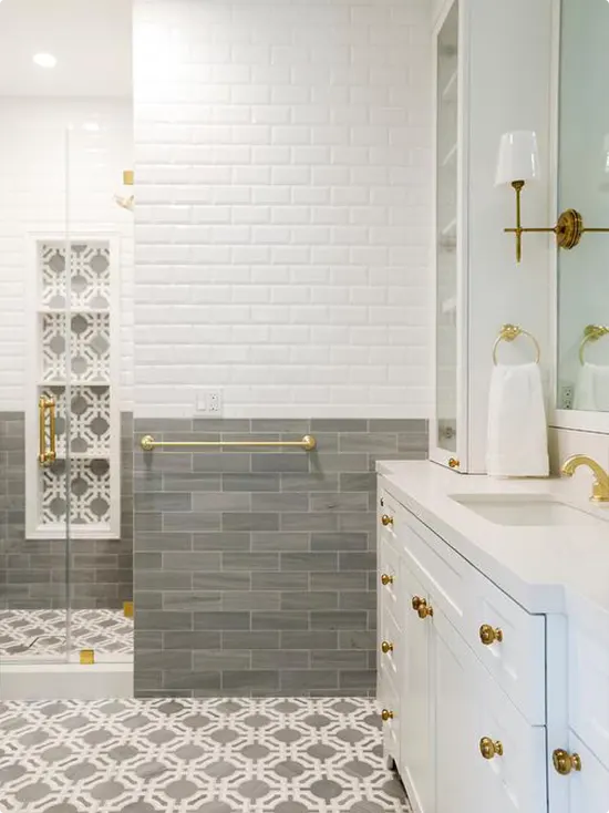
Two types of white-ish tile used here, but the magic is in how they’re layered.
White beveled subway tile on the upper half, gray rectangular tile on the lower half — and gold hardware tying it all together. It’s a really classic combination that feels fresh because of the warm brass tones.
The patterned cement tile on the floor is a standout detail. It brings in the gray from the wall tile and grounds the whole design.
A decorative lattice panel on the shower door is a nice architectural touch. White vanity with gold knobs stays traditional without feeling stiff.
Periwinkle Blue With White Beadboard
Soft periwinkle blue above, white beadboard below — this is a bathroom that feels calm from the moment you walk in.
The white cabinet mirror with crown molding framing adds a traditional, almost Victorian feel. Wall sconces on either side give warm, even lighting.
Classic white pedestal sink and traditional-style toilet complete the look. The small black and white hex mosaic floor with a border detail is a little nod to old-school craftsmanship that ties everything together.
It’s not flashy. It’s just really, really nice.
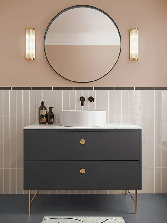
Coral Pink With Sage Green Color Block
This one is bold and cheerful and honestly kind of genius.
Coral-pink on the lower half, soft sage green on the upper half — a color combination that sounds risky but looks completely right together. A matte black industrial wall sconce overhead leans into the design-forward vibe.
A terracotta-toned vessel sink on a floating coral vanity keeps the color story going without feeling too much. Black wall-mount faucets add a strong graphic contrast.
The dark blue floor and black partition frame give the whole space an anchor so all that color stays grounded. It’s a bathroom that’s fun to be in.
Double Vanity With Scallop Tile Backsplash
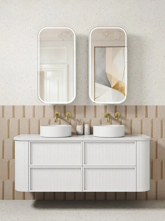
Two tones without being obvious about it — that’s the vibe here.
The lower section features warm beige scallop-shaped tiles with gold veining, and the upper half transitions to a speckled plaster-style neutral. The two textures play off each other beautifully without any harsh lines between them.
A white ribbed floating double vanity with dual round vessel sinks is sleek and modern. The two rounded LED mirrors with thin white frames feel like a matched set that’s still slightly asymmetric, which I think is the best kind of intentional.
Gold wall-mount faucets tie into the tile’s warm tones. It’s refined, it’s current, and it’s the kind of bathroom you’d see in a really good hotel.
FAQs About Two-Tone Bathroom Walls
What is a two-tone bathroom wall?
A two-tone bathroom wall means using two different colors, materials, or finishes on one wall — usually split horizontally. The bottom half might be tile or painted in a dark shade, while the top half uses a lighter color or a completely different material.
What is the best color combination for a two-tone bathroom?
It depends on the look you’re going for. White on the bottom with almost any color on top is a safe and reliable choice. For something classic, try navy or sage green with white. For something bold, terracotta or coral with white tile works really well. The key is keeping at least one side neutral so the two tones don’t compete.
How high should the split be in a two-tone bathroom wall?
Most people do the split at around chair rail height, which is roughly one-third of the way up the wall. That said, you can go higher — halfway up or even two-thirds — depending on the look you want. Going higher with the tile or darker color can make the bathroom feel more dramatic and cozy.
Does two-tone work in a small bathroom?
Yes, actually. Keeping the lower half in a lighter color or white tile can make a small bathroom feel taller and more open. Just be careful with very dark colors on both halves — that can make a small space feel enclosed. Light on the bottom and a soft color on top is usually the safest bet for smaller rooms.
Can I mix paint and tile in a two-tone bathroom?
Absolutely — that’s one of the most popular approaches. Tile on the bottom half is practical because it handles water and humidity well. Then paint on the upper half lets you add color without a huge expense. It’s a smart, functional combo that also looks really intentional and designed.
What finish of paint should I use above the tile in a bathroom?
Always go for a satin or semi-gloss finish in a bathroom. These finishes are moisture-resistant and easier to wipe clean than matte. Matte paint in a bathroom tends to absorb humidity and can peel or show water marks over time.