
Two-tone bedroom walls are one of those ideas that look like you hired a designer but actually just took a weekend and some painter’s tape. It’s such a simple trick — paint the bottom half of your wall one color, leave the top another — and suddenly the whole room feels intentional and pulled together.

Two-tone walls add color, depth, and personality without making the room feel overwhelming. Sometimes it’s a soft neutral paired with a crisp white. Other times it’s a bold contrast that instantly catches your eye. Either way, the mix of two colors can make even a simple bedroom feel more thoughtful and custom.
You don’t need a huge budget or a complete makeover to pull it off. A painted half wall, a color-blocked accent area, or even a subtle tonal combination can completely change the mood of a space. Funny how a line of paint can do so much, right?
If you’re looking for fresh ways to give your bedroom a little more character, these two-tone bedroom wall ideas are packed with inspiration. From cozy and calming to bold and modern, there’s something here for just about every style.
Also Read: 23 Two-Tone Hallway Wall Ideas
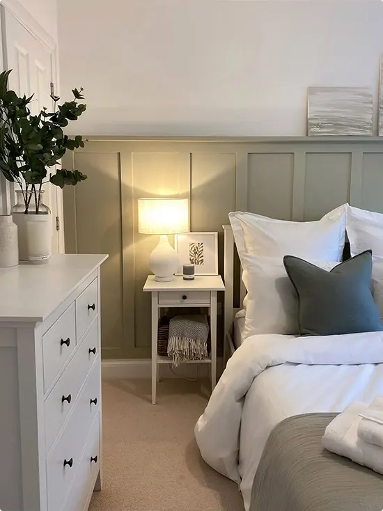
Sage Green and White
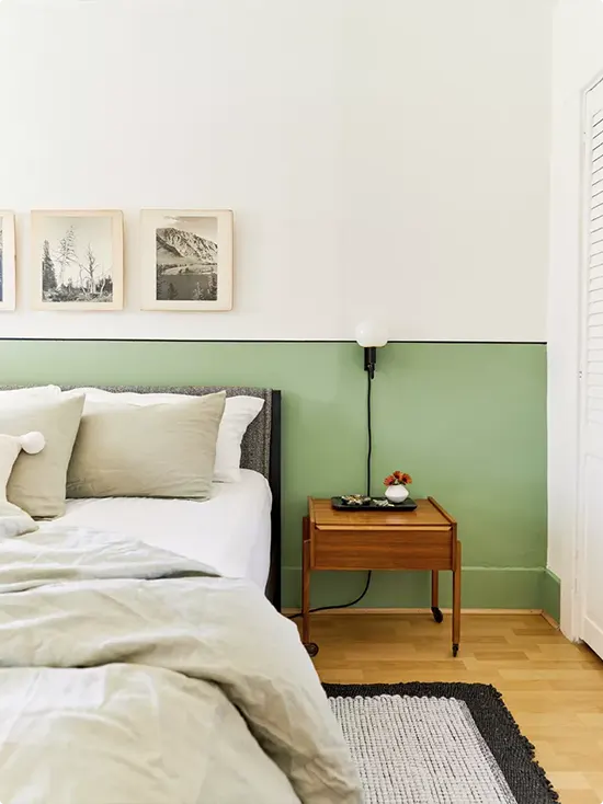
The lower half of this wall is painted in a soft sage green, with crisp white above it. The split sits right at headboard height, which makes it feel very intentional.
Two framed nature sketches hang just above the color line, and the warm wood nightstand ties everything together nicely. This combo works because the green is calm without being boring — it feels fresh, almost like bringing a little bit of the outdoors in.
Mustard Gold and Blue-Gray
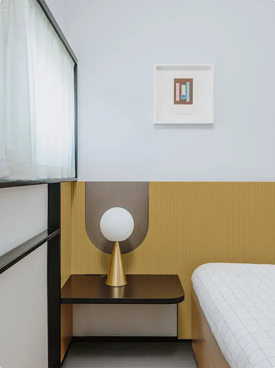
This one has a built-in fluted panel along the lower wall, painted in a warm mustard-gold tone, with soft blue-gray above. The dark floating nightstand and that little globe lamp make it feel super sleek and modern.
What I love here is how the fluted texture adds depth without clutter. It’s the kind of bedroom that looks like it belongs in a boutique hotel, and honestly, that’s a compliment.
Sage Green and Cream
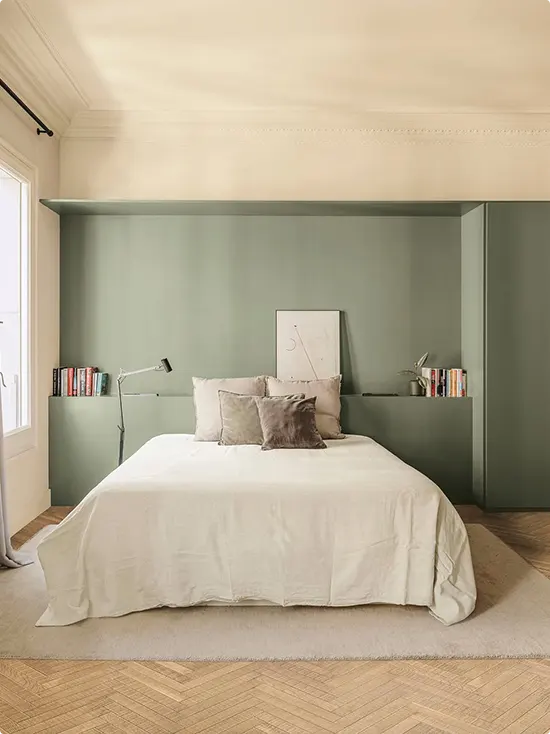
This is a genius use of a two-tone wall. The sage green wraps around the bed and extends into built-in shelves on both sides, creating this cozy nook effect. The creamy ceiling and upper wall keep it from feeling too heavy.
Books, a reading lamp, and a simple framed sketch tucked behind the pillows make it feel lived-in. It’s practical and pretty at the same time, which is my favorite combination.
Navy Blue and White
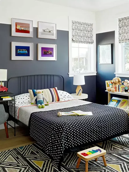
The lower half is a deep navy blue, and the upper half is white. The contrast is strong, which totally works for a kid’s room — especially with those bright colorful car prints lined up above the color break.
The patterned rug, polka dot bedding, and geometric roman shades all play well together without feeling chaotic. Navy is one of those colors that grows with a kid, too, so it won’t feel babyish in a few years.
Navy Blue and Cream
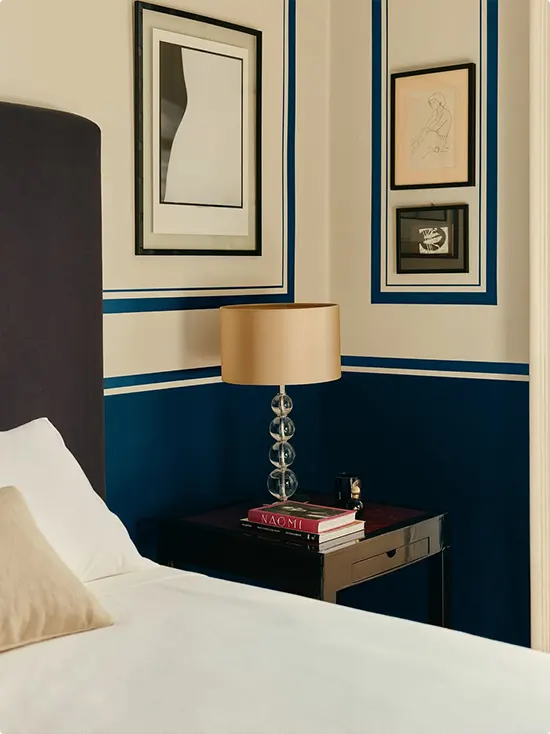
This one uses navy as thin painted border lines on a cream wall, almost like decorative molding. The lower section is a deep solid navy, and the upper part stays creamy and light. It gives the room a very elegant, almost vintage feel.
The gold lamp, stacked books on the nightstand, and black-framed art all lean into that refined vibe. It’s the kind of room that feels grown-up and sophisticated without trying too hard.
Teal and White
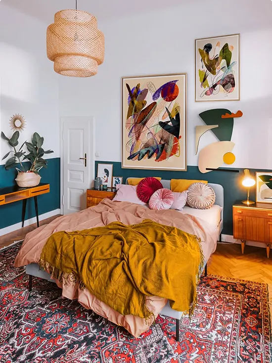
The bottom half here is a rich teal, and the top is white. But what makes this room really special is everything layered on top — bold abstract art, a vintage Persian rug, mustard yellow throw, and a rattan pendant light hanging overhead.
It’s maximalist in the best way. The teal acts as a grounding base for all that color and pattern happening above it. Without it, the room might feel scattered. With it, everything belongs.
Terracotta and Cream
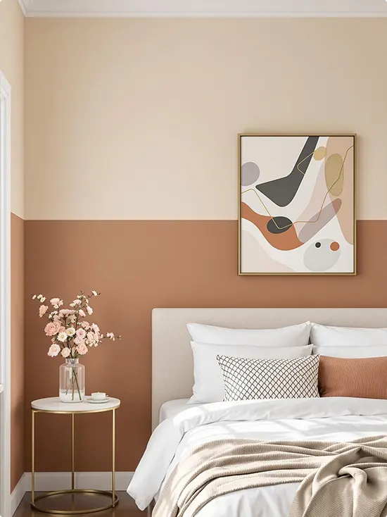
The lower half of this wall is a warm terracotta, and the upper half is a soft creamy beige. The split lands right at about mid-wall, and the transition feels effortless.
A gold-framed abstract print hangs on the upper section, and a marble side table with pink flowers sits below. The whole palette — terracotta, cream, blush, and gold — feels very warm and welcoming. This one is great for a bedroom that needs a little coziness.
Sage Green and White Paneled Two-Tone Bedroom Wall
Here, soft sage green paneling covers the lower half of the wall while the top stays white. The white dresser and white nightstand keep it light and fresh.
A round white table lamp, a small framed botanical print, and a dark teal accent pillow are really all this space needs. It’s proof that you don’t need a lot going on to make a room feel complete.
Cobalt Blue and White
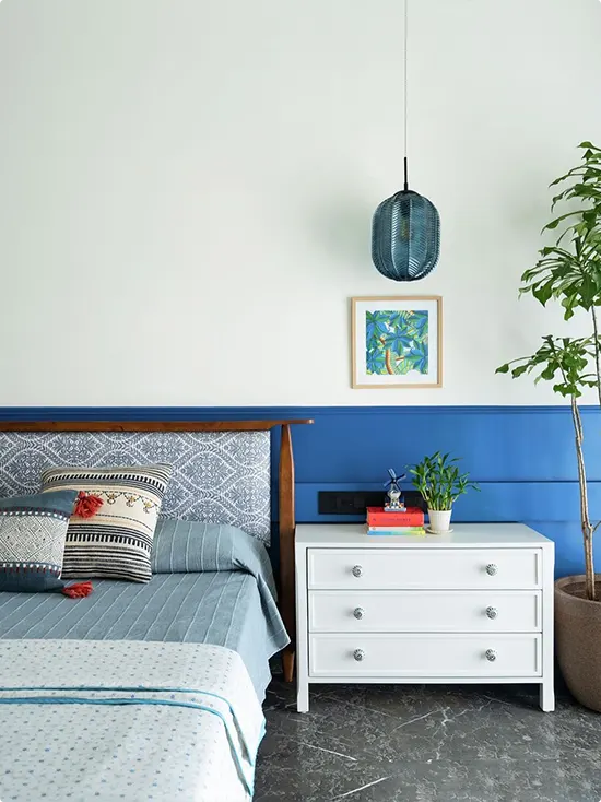
A strong cobalt blue runs along the lower half, and a clean white takes over above it. The patterned wooden headboard, textured throw pillows, blue pendant lamp, and big leafy plant give it a relaxed, boho kind of feel.
The white dresser against the blue wall is a nice contrast. And that small framed tropical print right in the middle? It works perfectly as a focal point without taking over the whole wall.
Forest Green and White
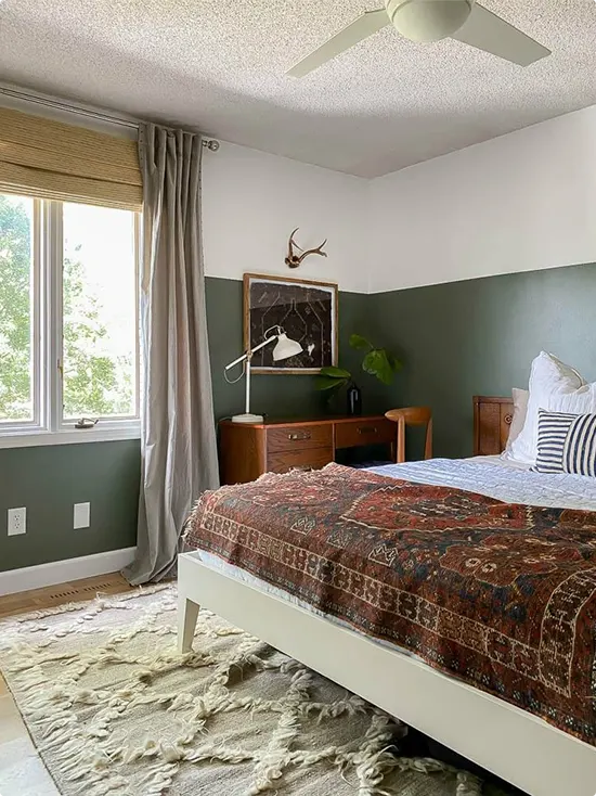
The bottom half of this wall is a deep forest green, and the upper half is white. What makes this room so interesting is what’s inside it — a Persian-style bedspread, antler décor, a mid-century wooden dresser, and a shaggy layered rug.
It feels like a cozy cabin and a stylish retreat at the same time. The dark green anchors all those warm earthy tones beautifully. I’d honestly wake up happy every morning in this room.
Yellow and White Diagonal
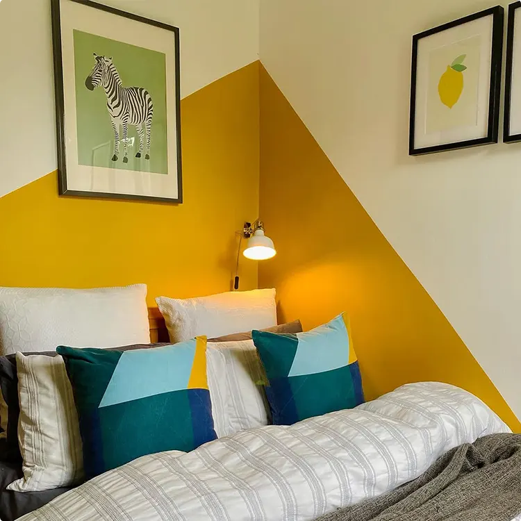
Instead of a straight horizontal line, this two-tone wall uses a diagonal split — bright yellow on one side fading to white. It’s unexpected and so fun.
A zebra print and a lemon print hang above the bed, and colorful geometric pillows tie in the yellow. This is a great option if you want something a little more creative than the usual horizontal stripe.
Light Gray and Charcoal
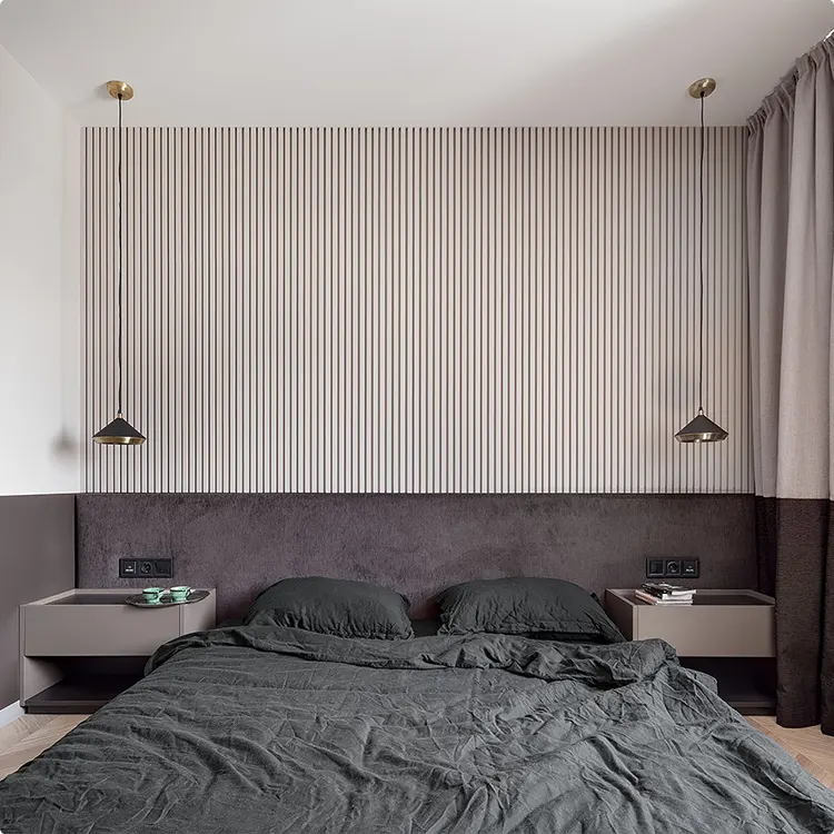
The upper wall has a light vertical slat panel — almost like a wood accent wall — and the lower section is a deep charcoal velvet-wrapped headboard that extends to the sides. Two black pendant lights with brass caps hang from the ceiling.
The dark gray linen bedding completes the moody, masculine look. It’s minimal but dramatic. The slat texture keeps the wall from feeling flat, and the whole thing works without a single piece of art on the wall.
Light Green and Off-White
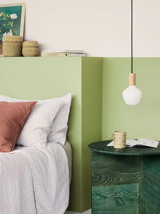
A muted green covers the lower half of the wall and extends into a little built-in shelf at the top of the color line. The upper wall stays a warm off-white. A pendant lamp with a wooden cap hangs low over a round dark green side table.
Woven baskets on the shelf, a stack of books, and a ceramic mug on the table keep things feeling casual and lived-in. This one feels like a quiet Sunday morning, which is exactly the energy a bedroom should have.
Burgundy and Dusty Rose
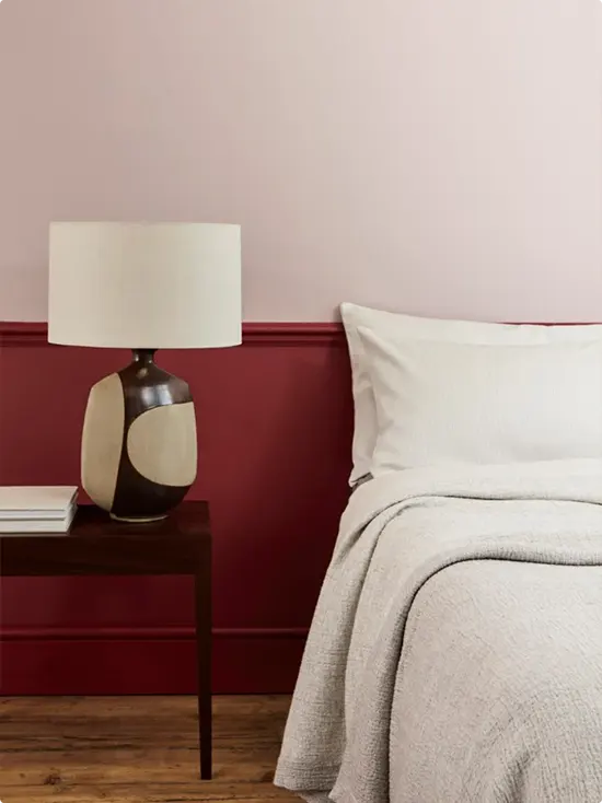
The lower half of this wall is a bold deep red — almost burgundy — and the upper half is a soft dusty rose. The two shades are related but different enough to create a clear split.
A ceramic lamp in brown and cream sits on a dark wood nightstand, and crisp white bedding keeps the whole thing from feeling too heavy. It’s a brave color combo, and it absolutely pays off.
Deep Purple and Greige
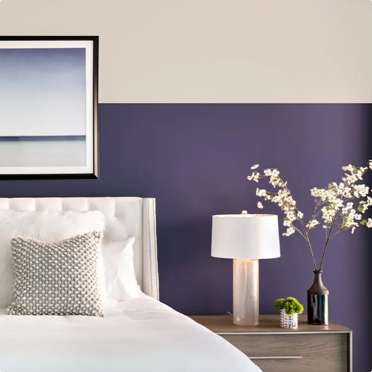
A deep purple-violet covers the lower half, while a warm greige takes the upper half. The tufted white headboard and soft neutral bedding make the purple pop without clashing.
A glass lamp, a moss ball, and a tall flowering branch in a dark vase sit on the wooden nightstand. It adds just enough life to the space. This combo is unexpected but really, really works.
Sage Green and White
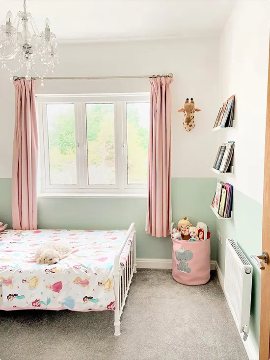
The lower half is a soft sage green, and the upper half is white. Pink curtains and princess bedding keep it girly without going overboard on pink.
Small floating shelves hold books, and a stuffed giraffe wall mount adds a fun, playful touch. A pink toy basket on the floor rounds it out. It’s a really sweet room that could grow with a little girl for years.
Olive Gray and Greige
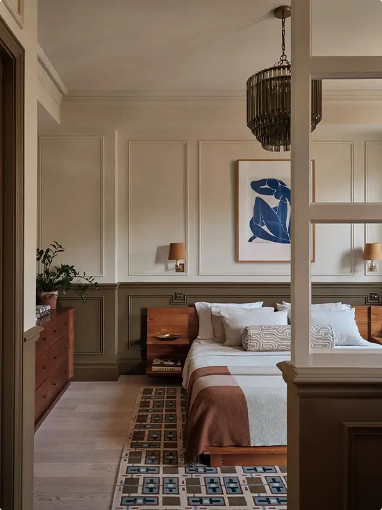
The lower half of this room has painted paneling in a warm olive-gray tone, and the upper walls are a soft greige. Crown molding and the overall trim work give it a very tailored, classic feel.
Walnut nightstands, amber wall sconces, and a blue figurative art print above the bed add warmth and character. The patterned rug ties it all together. This is the kind of room that feels expensive without being flashy.
Mustard Yellow and Blush Pink
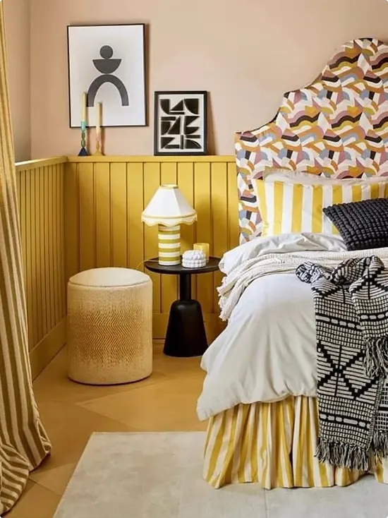
Mustard yellow beadboard panels run along the lower half of the wall, and the upper wall is a warm blush pink. The headboard is covered in a bold geometric print that somehow matches everything.
A striped lamp, a round woven pouf, and black-and-white throw blanket keep things balanced. There’s a lot happening in this room but it never feels messy — just cheerful and creative.
Blush Pink and White
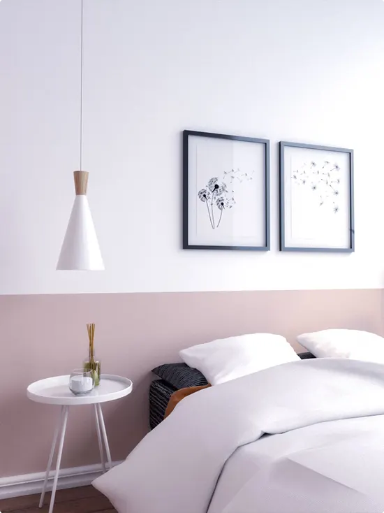
A soft blush pink covers the lower portion of the wall, and a clean white takes the top. Two matching black-framed dandelion prints hang right at the color break, which is a nice way to draw attention to the line without making it feel abrupt.
A white cone pendant lamp and a little round side table with a reed diffuser finish the look. It’s minimal, soft, and really easy to copy. Perfect for anyone who wants calming without being boring.
Charcoal Gray and White
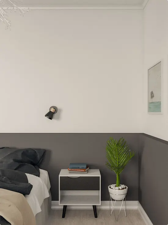
A cool charcoal gray covers the lower half of the wall, and a soft white takes the upper section. The white open nightstand and a small potted palm keep the space from feeling heavy.
A black directional wall sconce and a simple landscape print on the right add just enough visual interest. The contrast between the gray and white is clean and modern. Simple, but it works every time.
Matte Black and White
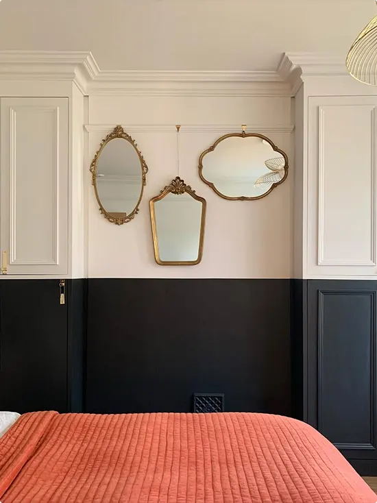
The lower half of this wall is painted a deep matte black, and the upper half is a soft white with gorgeous classic panel molding. Three mismatched gold-framed vintage mirrors hang right at the color break, and it looks so good.
The coral-pink bedding pops against the dark lower wall in a way that feels bold but not chaotic. If you have a room with existing panel molding or trim, this two-tone approach really makes the architecture shine. And honestly, that mirror trio is a genius alternative to hanging art.
Also Read: 21 Two-Tone Bathroom Wall Ideas
FAQs About Two-Tone Bedroom Walls
Where should the split be on a two-tone wall?
Most people go with a split at about one-third to halfway up the wall. Chair rail height (around 32 to 36 inches from the floor) is a popular choice. If you have a tall headboard, it can also look great to match the split to the height of the headboard.
What colors work best for two-tone bedroom walls?
Soft neutrals like sage green, warm beige, and greige are easy to work with. For a bolder look, deep navy, forest green, terracotta, or burgundy on the lower half with a light color above always look great. The key is keeping one shade light and one shade either deeper or more saturated.
Does a two-tone wall make a room look bigger or smaller?
A lighter upper wall and a darker lower wall actually makes the ceiling feel higher, which can make a room feel bigger. Going too dark on both halves can make a room feel smaller, so balance is important.
Can I do a two-tone wall in a small bedroom?
Absolutely. A soft two-tone split — like blush pink and white, or sage green and cream — can make a small bedroom feel cozier and more designed without overwhelming the space.
Do I need painter’s tape for a two-tone wall?
Yes, using painter’s tape will make a huge difference. Apply it carefully along the split line, press the edge down firmly, and remove it slowly while the paint is still slightly wet for the cleanest result.
What finishes should I use for a two-tone wall?
A matte or eggshell finish works well for the upper section, and a satin finish on the lower half is a good idea since it’s easier to wipe clean. Both finishes together also give the wall a subtle visual distinction even before you notice the color difference.